I decided to write an article on colors before I get into a full five pages (!) on how to focus a Leica M. The majority of Leica users seem to prefer black and white photos. So here we are, lets talk about colors.
When I got the Leica M9 in September 2009 I quickly realized that I could set the camera to shoot a color DNG and a JPG Fine at the same time. (As the DNG is always in color because it is the raw data from the sensor), I set the JPG Fine file to black and white.
This setting have the clear advantage that when I import the photos into Lightroom, I get color and black and white, side-by-side, of the same photo. This makes it very easy to see how the same photograph looks in color vs black and white.
In Lightroom the DNG in color will be next to the JPG in black and white and it is easy to see how the photo works in both color and black and white so you can decide which to use - or to use both!
Sometimes I like both, sometimes the requirement from the client is that it has to be in colors (and only in very rare cases that it has to be black and white).
In many cases, using the Leica M9, I liked the black and white photograph the most, just as the majority of Leica photographers seem to do. The majority of my photographs ends up being in black and white if there is nobody external who ask for colors. For my signed exhibition prints I usually like the black and white photos the best.
I would estimate that about 70% of all Leica photos out there are black and white. Not because the camera only does that but because the person behind the camera decides that it looks better.
Full Leica M240 Pack:
Video Masterclass
+
Street Photography Masterclass
All about the Leica M240 video instruction masterclass (17 videos)
+ Street photography video masterclass
filmed in New York (11 videos).
+ 8 Bonus videos
+ Styles for Capture One for Leica M240
+ Lightroom Presets. for Leica M240
Normal price $1,192.00
Save 60%
Only $476.00
USE CODE: "ILOVEM240"
Order now. Instant delivery.
100% satisfaction or money back.
Item #1844-1848-0823
Leica M240
Video Masterclass
Two hours of video class
with Thorsten von Overgaard
+
20-page checklist for learning
every corner of the Leica M240.
Order now. Instant delivery.
100% satisfaction or money back.
Item #1844-1017
Some time ago I tried to make life more difficult by giving myself a challenge. I thought about changing my standard lens from the 50mm to a 35mm.
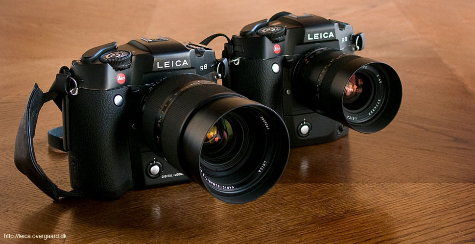
Before I got to do it, I happened to have a few people who had asked where my color photos had gone. They missed my "color fidelity" from when I did a lot of color film slides and used the Leica R9 with the DMR digital back.
Buy the new eBook
"The Freedom of Photographic Expression"
by Thorsten Overgaard
"The Freedom of
Photographic Expression" eBook for computer, Kindle and iPad
Released March 2024.
First editon: October 2016
Now 303 pages.
In this easy-to-read and easy-to-apply eBook,
Thorsten Overgaard takes beginners and experienced photographers through the basics of controlling the light and the camera.
This book covers the technical side of photography from beginners level to semi-pro, features a number of photographs by Thorsten Overgaard and chapters on his philosophy on photography.
Only $248.00
Buy Now
Instant Delivery.
"I've bought the new book - made a start reading it - it is really interesting.
I know it’s basic at the beginning but it isn't written in a patronizing way. I have been taking photographs for many years and have been lucky enough to be paid to take them for the last seven years; but it's always good to be taken back to the start"
P. S. (UK)
"Really enjoy your writing and teaching"
D. K. (USA)
"I love your insights on photography."
D.B. (USA)
★
★
★
★
★
★
As it often is when someone mention something they like, I took a look at my photographs with their eyes to understand what it is they see. I am often the last person to notice the obvious which others see very clearly, and often those obvious things are what distinguish ones style from others. (More on that on the next page).
I took a look at my color photos from 2010 and onward, and from that moment I decided that I would force myself to make more colors.
To make colors work.
All things are difficult before they become easy
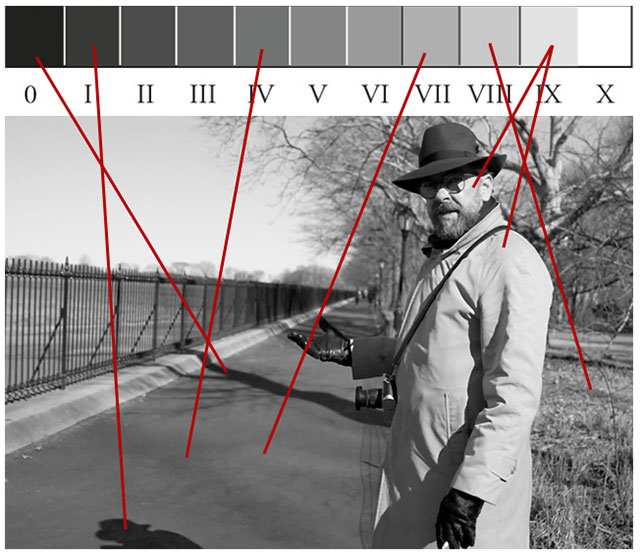
It's always an interesting discussion if color or black and white is easier than the other, but for most of us I think it becomes a habit to do either one or the other. I wouldn't say colors are harder to do, but black and white falls more natural. Black and white, I think, has more leeway for making the message and atmosphere shine through without disturbing colors, and traditionally you can work 3 stops up and down on black and white. You can't do that with colors.
I promised myself that from now on I wouldn't go with the first instinct and make the black and white the image. I would force myself to make the color work just as well, or better.
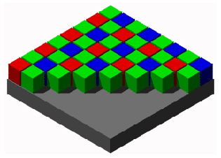
Maxwell worked with his color wheel. By placing colors on it and spinning it, the mix would be perceived by the eye as one color. By changing color elements he was able to study what each color (to the eye) was made up of.
The Bayer filter in a modern camera sensor is simply a mosaic of Red, Green and Blue filters on top of the pixels of the sensor.
The first home cinemas had a projector with three different projections: Red, Green and Blue.
The Color Triangle
With a little imagination, this is simply a triangle of Red, Green and Blue. The D65 in the middle is the white point (daylight white).
The subject of colors can be confusing, and I would rather prefer to simplify it. You don't have to understand the nuts and bolts of it all, so let me just give the basic history:
James Clerk Maxwell (1831-1879) discovered, in 1855, that all natural colors can be reproduced with only three basic colors, Red, Green and Blue. In our days often simply referred to as RGB, those are the colors represented in the eyes retinal.
Maxwell wrote the report "Experiments on Colour, as perceived by the Eye, with remarks on Colorblindness", in 1855 and presented the first color photograph in 1861 and later became even more recognized for his discoveries in electromagnetism. But remembered mainly for his discoveries in colors. I find it interesting that he researched light, electricity and magnetism; the key in futuristic technologies so advanced we yet have to understand and utilize them ... but that's for another day when we will talk about what light really is.
He made his first actual color photograph by capturing three monochrom photographs through each their red, green and blue filter, and then displayed them together on a screen at the Royal Institute in May 1861.
It's terrible interesting how little technology factually have moved forward since then, and this helps making our understanding of colors quite simple:
In film the way to capture and record the three basic colors red, green and blue is done with three thin layers of chemistry on top of each other.
In digital sensors the principle is not far from Mr. maxwell's first projection of colors. Each pixel is an "eye" in the sensor, and they are divided into three teams. One that sees Red, one that sees Green and one that sees Blue. Each pixel recording the luminance of red, green and blue by recording the light through a colored Bayer filter (see the illustration to the right).
In video there are semi-pro and professional "3CCD" cameras that record in much higher quality by having three sensors. One for each color of red, green and blue. Cheaper video recorders use one sensor to record all three colors; just like still cameras. (Fovecon made a 3X sensor for Sigma SD9 in 2002).
The Leica M Monochrom 246 may give more understanding to this as that camera is distinguished by not having a Bayer filter. No colored glass on top of the sensor to measure red, green and blue. All pixels have been directed to simply measuring the luminance of the light. No colors measured.
As a side-note, this is also what makes the discussion and understanding of 16-bit vs 14-bit and 12-bit so difficult to grasp: In a color sensor, it's basically three signals merged into one. In a monochrom sensor it is one signal that from birth is three times more detailed.
Hence, a 12 bit monochrom sensor is basically much more detailed than a 16-bit RGB sensor. At least in amount of detail. The question is then if a green amount of light has a different greytone than a red amount of light. A red wall obviously translates into a greytone, but can you record that red without taking the color into account? That's a discussion for another day.
The Color Triangle
If you get the idea that not much have happened since Maxwell discovered the three main colors, you are absolutely right.
Maxwell basically developed the "color triangle" which is what we often see today (and often don't fully understand). It is basically the mix of the three main colors and how much of it is visible for that sensor, calibration, etc.
But let's just nail that it is a triangle. That might help understand what it illustrates.
I have been writing on my new book "Composition in Photography" over the last months, and one of the chapters I think is really interesting, is the one about color photography.
We tend to look down at color photography as something everybody does. Which they do. But our misconception is that it is not possible to make something in color photography as artsy or classic as black and white.
The German-Australian photographer Helmut Newton said there are two ugly words in photography. One is "art" and the other is "good taste", and in the context of color photography, he nailed it. You will get why I think so, later.
Historically, color photography came about around 80 years ago, and to begin with the colors were not that great. Which didn't distract the fascination of colors at all, to begin with. You would find a few enthusiastic photographers who already in 1950 claimed that "we can now photograph the world in realistic colors" as if color photography had now been fully developed.
As all technology improves over the years, the colors got better and better but color film was still so slow that most who threw them self into color photography, focused on subjects that didn't move.
This resulted in a lot of stilleben and landscapes in colors, and very few people, animals and real life. Especially street photography, sports and documentary missed out on color photography that still moved with the speed of 12 ISO for a long while.
When color film finally offered the same possibilities of speed as black and white, the whole world became obsessed with color photography, color movies and color television. Hugely populized by Kodachrome and Agfa, even Paul Simon sang his praise to Kodachrome in 1973.
The world became a Kodachrome moment, everything was in color and everybody could do it.
Black and white had more finesse and style, or at least appeared more exclusive.
In other words, color photography generally never got embraced by 'art' photographers and 'serious' photographers. It was for the people.
It was also extremely expensive and difficult to develop and print quality color photographs yourself, but rather inexpensive to get some rolls of tourist films developed at the local photo store. That might also have been a factor. Color film requires very fresh chemistry, a lot of it, and everything must stay at very specific temperatures at all times. Complicated to do at home, perfect for industrialization of color photographs; as it happened when everybody started photographing in colors for the family album.
In contrast, black and white is much easier and much more economical to work with at home and in small scale.
The street photography and serious reportage for many years was done in black and white, and often by choice of the photographer. When newspaper technology caught up with colors (worldwide around 1985), the demand from editors to get colors forced the photographers to make their reportage photos in color.
Yet, when we look back at history, how many grand moments of history are recorded in color, and how many are recorded in black and white?
Today all those barriers are removed, and yet 70% or so of Leica photographs are finalized in black and white.
We have very fast and very precise color photography, and the question is if we ever gave it a serious try?
Did we ever embrace color photography as a way to express serious ideas and aesthetics?
I think not, and that is why you will hear me say that if you want to search out new frontiers in photography, color photography is the place to go.
At least I find it so challenging to find a language and a style in color photography that it will take me some years to make something out of it that is not just another "Kodachrome moment".
Use the JPG file from the camera for black and white
Before we walk together into the beginning of the rainbow, let's talk about black and white for a moment more. The genius of the JPG Fine setting in the Leica M9 was that the JPG was a really, really good black and white file. A little bit of editing on the JPG Fine and you were done.
In fact, when I tried to convert the color DNG to black and white in Lightroom and edit it towards the look I would want from my black and white photography, I (almost) always ended up liking the cameras JPG Fine (that I had also edited towards the look I wanted) better when I compared the two.
The DNG is 14-bit and has many layers of information from the sensor, the JPG Fine from the camera is 8-bit and have only one layer of information. Yet, the JPG in black and white from the camera wins in my opinion.
After having tested them against each other for a long while, I finally decided that the JPG Fine in black and white won over the converted DNG file in 98% of the cases. Only in very rare cases where I needed to fix something would the DNG offer something I liked better.
Too much in photography is based on others opinions about what is right to do. But when you look at your own photography, you are able to decide what you like the best. It's much easier than trying to guess what others would like the best, or which "errors" they would point out.
I can't predict what others might like me to do. So I do what I want me to do.
I make the final call.
The black and white JPG and the color DNG have the exact same resolution and definition. This means that when I look at the image on the screen, that's how it's going to look. I can print the JPG in six feet tall prints (and I have) and the file is good enough. Nobody is going to show up in the gallery and be able to tell if it was made from a DNG or a JPG File.
Given these conditions, I can make decisions about anything. And I decided that I would use the JPG Fine in black and white as the final original.
No matter if I do color or black and white, I usually spend 30 seconds to 3 minutes editing an image in Lightroom. It that doesn't work, the image simply doesn't work. (The next page in this article will be about editing).
Leica M 240 JPG file almost as good as the Leica M9 JPG file
When the Leica M 240 came in March 2013, I tested the DNG vs the JPG Fine again for a while and decided that the JPG Fine in 90% of the cases was the best for black and white.
The Leica M 240 has some times a weird conversion of DNG colors to black and white. There will suddenly be spots or noise in red and orange (and some times blue and green tones as well), so often you will get noise in the skin tones if you use the DNG for black and white. For those reasons the JPG Fine in black and white from the camera is the one I go with.
In rare cases I am not happy with the JPG Fine in black and white and will have to work over the DNG. I convert it to black and white by simply clicking "black and white" in Lightroom and work with it till I think it is final. Then I will compare with the JPG Fine in black and white and decide which of the two to use.
Some times it makes a difference if you "de-saturate" a DNG instead of just clicking "black and white" in Lightroom but I only go into that if I am not satisfied with the look.
Generally I don't spend much time worrying about what would happen if I did this or that in some other way or with some other software. I occasionally test things up against each other, and based on that I establish a workflow that I follow. In 90% of the cases the JPG Fine in black and white from the Leica M 240 looks perfect to me.
Often, if there is a reason to do so, I will save a sample of both the color and the black and white photo. I might feel like the black and white right now, but it's good to have the color version in the archive as well for the day you wake up and have to do an article about colors.
It is a good idea to build into your workflow to be able to see the possibilities in both. When working from color to black and white and then color to black and white, and so on, it might ruin your vision and judgment a little.
Try eventual to deal first with the black and white JPG's, then take the colors as another separate batch after that.
Color from the DNG file of the Leica M 240
Black and white from the JPG file of the Leica M 240
Ruddy Rodriguez portrait session in London, 2015.
The Leica M 240 or the Leica M Monochrom..?
It was a great idea - and a daring one - when Leica Camera AG introduced the Leica M Monochrom in May 2012. A Leica M camera that did only take black and white photos, which is what the majority of Leica users anyway's does. The fact that the camera was more expensive than the Leica M9 that it was based on signaled it was specialized and superior.
The intention was to make a camera that did black and white so well that people would stop dreaming of their old black and white film and darkrooms.
My good old Leica M4 film camera.
But also an intelligent answer to all other Leica M users who - evidently - prefer black and white 70% of the time.
The choice between a Leica M that does color, or one that only does black and white seems to be a hard choice, but for me it is easy. I simply did as many others, I bought them both.
The Leica M Monochrom with its higher ISO was a dream of new possibilities. Then when the Leica M 240 came some months later, with almost the same ISO possibilities, as well as faster operation and colors, that one became my daily camera.
I did do somewhat 40,000 images with the Leica M Monochrom, but then I "got over it" and parked it in the camera closet. (The new Leica M Monochrom M 246 have had about the same life cycle with me, but with the added disappointment that Leica Camera AG put very little work into actually making it a monochrom sensor. The result being a camera that has advantages in the middle-to dark tones but is weaker than the Leica M 240 in the upper 20% of bright tones).
In the winter of 2014 I took the Leica M Monochrom with me on my tour to Asia, and whenever someone in my workshop praised all the joy, fun and unique pictures they got from using this Leica M Monochrom camera, I would get smitten and take it out, leaving the Leica M 240 at the hotel.
Just to realize after a couple of hours that I didn't feel it. Or if I did, it wasn't the same as earlier. So I decided to stop fooling myself and let me talk myself into trying to re-experience my Leica M Monochrom enthusiasm.
Maybe that left an empty space in my photographic life, because then I started wondering what I could do of things to challenge myself. I thought about forcing myself to use a Leica 35mm Summilux-M ASPH f/1.4 for everything for some months. But then I got the idea to make more colors and decided to make that my challenge.
That was how the Leica M Monochrom worked on me. I started seeing the colors I couldn't get, and it made me wonder in silence what I would do with 'em colors if I could get them.
With digital raw files, which is essentially a complete recording of all what the sensor sees, the full batch of data is exported to a software program as Lightroom or Capture One which translates the bits and bytes to a color photograph by using a Camera Raw Profile for that specific sensor and camera.
Photographic recordings are not very different than sound recordings in that a precise "spot on" recording is better than one that is slightly off. Correct recorded sound is better to play on loudspeakers than sound recorded too low or too high, later corrected.
Aesthetics is a balance, and unaesthetic is an unbalance. Notice next time you walk by a person with just an understated air of perfume how well that works, compared to a person disguising bad smell with a strong perfume.
Color photography is in the same way. The correct balance is very exact, and as soon as the white balance has been set, the exposure is the next correct balance to achieve.
Apply
code "UPDATE113" on checkout to get this complete version 11.3 update.
$298.00
Updates all previous Surival Kit versions since 2009.
Buy the complete new
Lightroom Survival Kit 11.3
The Legendary Tutorial for Photographers
Brand-new JUNE 2022-version.
Now with brand-new 4+ hours of video tutorials.
New sections on compostition and storytelling.
How to edit color photos.
How to edit black & white photos. How to do keywords logical and easy.
The most successful photo editing kit ever
Photographer Thorsten Overgaard first released the Lightroom Survival Kit in 2009 and have honed it with new and fresh updates. This Version 11 is the most radical updated and renewed version ever, four years in the making.
Professional workflow experience made simple, logical and easy to use.
Master editor makes it simple to understand
The Survival Kit is unique and one-of-a-kind being made for photographers for photographers. When someone understands their subject, they can explain it so it is easy to understand. The hallmark of Thorsten Overgaard is to make expert knowledge shown and told in a way so anyone can apply it.
Hands-on advice that works
With a 450 pages workbook and 4+ hours of video, every element of digital photography is touched on, in handy chapters and pre-flight checklists. Editing of color vs black and white photos, keywording, cropping of images, fine-tuning of tones, color balance and color control, export of originals, printing, archiving and backup, and much more.
Comes with the Overgaard Leica Presets (Value $48)
The Lightroom Survival Kit comes with Thorsten Overgaard's special-made Lightroom Presets for all digital cameras and for Leica digital cameras.
Understand all from camera to the final print
Chapters in this version goes over the background for High Dynamic Range (HDR), digital raw files and how to set up a professional photography workflow, from calibrating the screen to editing in Lightroom, and to making a final print. And more ...
10+ years experience in one package
No need to spend years figuring out the smartest way to do things when you can tap into the best way of doing things right here. The workflow of Thorsten Overgaard as been refined through years of field work with more than a thousand workshop attendees.
This method of workflow now used by thousands
The Survival Kit has been taught to thousands in workshops and in this Survival Kit. What does it do? It make you enjoy taking and making photos, and it increases your production considerabely. Most important of all, it'll give you back ownership of your files (which you will understand why is so important, once you have bought the Survival Kit and started applying its methods).
"Thorsten's methodology is perhaps not what hardware-, software- and cloud-companies want us to do, but as a former IT engineer I can only acknowledge his views about preserving our digital heritage. This workflow explained is for me the best I have ever seen".
★★★★★
Video tutorials, image files, presets, checklists, definitions, tutorials of Lightroom, that boils down years of experience to a workflow you can implement in less than one day.
The digital age have changed it slightly as we get a little more leeway in digital than what color film photography offered: The color film used to be extremely limited in latitude and with no correction possible. Unlike black and white film where an under-or overexposed negative could be corrected both in developing of the film as well as exposure in the darkroom, and by choice of photographic paper for the darkroom print.
Color slide film (which is positive color film supposed to be projected onto a screen or represent a high-quality color photo recording for darkroom print or scanning for magazine print) by nature had to be exposed 100% correct with a possible under-or overexposure of just 1/4 stop (= if the exposure was correctly 1/250 second, an exposure of 1/190 would be on the edge of over-exposure!).
Negative color film would allow for a little less precision as the negative could be corrected in the darkroom exposure and by the choice of paper.
For many reasons, as exact exposure of color photos as possible, is important.
Exhausting the digital sensor
Incorrect exposure might over-exhaust the sensor and software. A sensor only sees one level of sensitivity (200 ISO in the Leica M 240 and 160 ISO in the Leica M9) and everything else (such as 800 ISO or 3200 ISO) is depending on an algorithm that calculates how the colors should look if the sensor could see 4 times better (800 ISO) or 16 times better (3200 ISO).
This is the reason correctly exposed color photography will look wrong at 6400 ISO colors (32 times more light than there actually is).
Any departure from what the sensor actually sees is stressing the algorithm to some degree.
If you add wrong exposure to this, like an under-exposure of 1 stop (for example a 1/250 of a second exposure where the correct would be 1/125 of a second), you are stretching the algorithm even more. And that is why an under-exposed or over-exposed color photograph is much more damaging to the final result than in a black and white photograph where it is only the amount of light that has to meet a final result; not as in color photography where three colors has to meet in a matrix that equals what the eye saw.
The error we mostly are guilty in, is to criticize the sensor or camera for not having correct colors! The error is to think that the camera records the color. No, the camera records three colors that in balance makes up that color, and exposure as well as the color temperature added by light sources alter that balance.
Therefore, when the colors are wrong, it is more likely that the photographer should be criticized than the sensor! Correct exposure by using the internal light meter or an external light meter is merely a method to control the light intensity, not the differences in color brightness.
The color brightness could be said to be the artistic judgment you as a photographer has to govern. You have to train your eye to see and recognize a beautiful composition in terms of colors, or recognize that this won't work.
I will say it again: Color photography might be the new frontier for those photographers who wants a new challenge in life and dream of taking it a notch higher.
The PUSH and PULL terms explained
In film photography the term PUSH was used to describe when you loaded a 100 ISO film into your camera and realized that the venue you were photographing at was too dark. What do you do? You changed the camera settings to 800 ISO and thus pretended you used a film that could see 8 times better. That is PUSH.
If you put ina 400 ISO film into your film camera and exposed it as less lightstron, say 100 ISO, it is called PULL.
When you dropped off the film at the lab you would ask them to "push it to 800 ISO" and the lab technician would consult the specifications from the film producer and see that for particular film he should leave the film in the chemical bath with developer for 32 minutes instead of the usual 6 minutes. This would result in a PUSH film where a 100 ISO film would behave as a 800 ISO film.
Just like there are digital algorithms today, there were chemical algorithms back in the film days.
It works. Only when you PUSH a film, you get more grain/noise and less accurate tonality and colors. That was the price you paid. And that is the price you pay in digital as well.
In digital sensors, everything apart from the base ISO of the sensor (200 ISO for Leica M 240 and 160 ISO for the Leica M9) is basically PUSH, but most of the changes of ISO will work rather nicely. Only when you exhaust the sensor beyond what will look good, we refer to it as PUSH.
You will see that the Leica M 240 says PULL 100 ISO and PUSH 6400 ISO which basically means that if you go 100 ISO or 6400 ISO you move outside what will give neutral colors.
If the light is mixed or of bad quality, the area you can work in is less. 200 ISO to 800 ISO or 200 ISO to 1600 ISO. In many cases 3200 ISO will work, but in some cases 3200 ISO is pushing it.
If you don't get the exposure right, you limit the working space of ISO you can expect to result in exact colors, and if you don't get the white balance right, you also limit your working space of ISO you can work with and expect the colors to be right.
Colors of the Leica M 240 are not as the ones on the Leica M9
Some people have spent a lot of time and energy debating with them self and others if the Leica M9 colors or the Leica M240 colors were the better colors.
I cannot take such a discussions serious. The fact is that the colors change from Kodachrome to digital sensors and to the next digital sensor. It will never end. Technology changes, and in this case the sensor changed from a CCD to CMOS. (The Leica M9 has a CCD-sensor, the Leica M 240 has a CMOS sensor).
The question is not how the cameras colors look, but how your colors look.
If you are concerned about how the camera make the colors look, you should start looking at how you make the colors look. The file from the camera is just the raw material for your color photography, just as the paint is the raw material for the painter.
The Leica M10 has colors very likely to the Leica M9 colors. When Leica Camera AG developed the Leica M10 (released January 18, 2017), they did a very intersting experiment where they asked people to choose which image they preferred from the Leica M9 / Leica M 240 / Leica M10 with many identical images (before the Leica M10 was finished) and it was certainly true that people preferred the Leica M9 pictures to the Leica M 240 (although they could not reliably tell them apart).
The color response for the Leica M10 was carefully managed using the results of this test (and also a huige library of images). That's how Leica Camera AG managed to make the Leica M10 colors instantly liked by the Leica M10 users.
My experience is that colors is a very autonomous subject, just like photography itself. Whatever you like, or whatever you find that works - that's is what is right for you and there is not much point defending or excusing what you like (and even less in arguing why others are wrong because they don't do what you do).
The eye can differentiate between more than 3 million colors but we only have names for 20 to 30 of them. That makes it a subject it is difficult to have a conversation about. The conversation has to be build around something we like or something we dislike, and even then the conversation will be very limited as we have so few words to express what we see.
Add to those 3 million colors that we deal with harmonies and wavelengths, plus all the tools of composition (geometry, balance, timing, rhythm and message to name a few) and the viewers background to perceive a stated or unstated message.
The sensor of the Leica M 240 is recording 12 bit which makes it capable of recoding somewhat 70 - 100 billion shades of color.
Limited time offer for my readers from Serge Ramelli: When Serge Ramelli attended my workshop we spoke about letting my readers have some of his courses in Lightroom at special prices. This is the first one. Simply click on the link and use the code: THORSTEN to get 60% off the price.
The Dress and the our disagreement on colors
You may recall the dress that went viral in 2015 where people were discussing if it was white and gold, or blue and black.
I actually bought that dress back when with the intention to test it.
The dress was not made by The Illuminati after all. But the photo that went viral might have been. Here is the original mobile phone photograph and what can happen to it during different light conditions.
White balance adjusted by picking the light from the white wall in the bottom of the photo.
Lightroom Auto White Balance applied.
The white balance warmed, the exposure increased, as well as shadow details.
The story was that Cecelia Bleasdale bought a dress and wore it at her daughters wedding. From the compliments she got it became obvious to her that some people saw it as white, others as blue. At least that is how the story goes. So a friend, Caitlin McNeill, took a mobile photo and put it on her Tumbler account and asked what people saw.
The Dress went viral on Twitter, Facebook, talk shows and all, and still people seemed to see different colors.
I took this photo of the dress using a WhiBal greycard to get the white balance right, and also checked the light with the Sekonic Color Meter. Both methods ended up in the same Kelvin value (around 8,000-9,000) and he dress looks here as it does in real life: Blue and black.
You can still find pictures online by the tag #TheDress and get confused. What is obvious is that the original photo is really bad technically (mixed light, overexposed and made with a bad camera sensor) and that the colors can be altered by simply changing the white balance. But you cannot make the dress in my photo not blue that way. So it's the light used in the original photo, and the sensor of the phone used that plays a trick.
Here is what I can alter of the dress color in Lightroom to make it white (but not the black into gold):
Kelvin 8700, Tint -20:
Kelvin 8700, Tint -20:
Blue Hue -100
Blue Saturation -98
Purple Saturation -100
Blue Luminance +100
Purple Luminance +100
What I learned from #TheDress
There is more to the story about The Dress, and perhaps it somehow adds up all the confusion there is in the world about color photography. But what the story in essence show is these things:
1) You can reproduce colors correct fairly easily with one type of light source and using the simple methods to adjust white balance which are available in almost any camera (by using a WhiBal card or an external Color Meter).
When I photograph indoor in the daytime I will turn off the electrical light and use the light coming in from the windows only - or I will black out the windows and use the electrical light only. One type of light.
2) You can alter colors considerably in certain types of LED light that is "dirty" or simply goes outside the scale of what a sensor can register (usually 2500 - 11,000 Kelvin for a good sensor, likely less for a camera phone sensor), mixed might and by leaving the white balance to the "Auto".
3) People have different perceptions of colors, and when communicating colors in color photography, colors aren't always what they were supposed to be.
You can edit photographs on a screen that is way off in colors. Because all you see on that screen is wrong, you can trust that when you like the colors on it, it might actually work. You adjust your aesthetics and your eyes to liking certain looks, and everything you like will match that. When you read the news on the computer or watch a movie, it's all in the wrong colors (too cold or too warm, or too limited tonality).
It's not much different than the photographers who in 1950 claimed that color photography was a precise reproduction of real world colors.
The reason I am anal about calibrating my screens is that calibration gets the shadow details and tonality right, but more importantly that if I send a photo to someone, I know that my colors are right. Calibrating the screen is like expanding your vocabulary from 10,000 words to the full range of 35,000 words. You can make sense with 10,000 words, but you can articulate yourself more precise and aesthetic with 35,000.
Most Apple screens are pretty close to ideal settings and calibrating the screen will bring you closer to 100% correct. But generally they are 85% - 95% from the factory.
If you invest $79 in a screen calibrator you need only to calibrate your screen one time. For most LCD screens it doesn't really change in the computers lifetime. A more expensive screen calibrator will not make the colors more precise, only the calibration more complicated.
We don't see colors the same
The fact is that we perceive colors differently. Partly because we have no vocabulary to describe them and partly because we factually don't see the same.
It's a scale or differences, and the only thing you can say is that when we cross some defined lines, it is categorized as colorblind. And nobody can explain what it is, nor do something about it. The difference in how we se colors is so little documented that it is somewhat a wonder.
I've had students that was so colorblind that they never wanted to do color photography. My response to this is that nobody would be able to tell anyway's, so why bother? You might have perfect color vision but bad taste, or bad color vision but great taste.
No matter how you see colors, and no matter how others may perceive the colors you make, there is a basic technology you have to master to get colors right in a photography.
The interesting thing about bad light in a store, in an office or a home is that you get used to it. Therefore, what you like, you can pretty much trust will work.
If you show a great photo that you like the colors of, most other people will like the colors too. But if the grass looks green-blue to you but warm green to another, who cares? It's the final colors that count, and as long as you stay away from discussing the colors, trying to name the colors, you can simply let the photo speak for itself.
Colorblind people does not see the world in monochrome. Colorblindness is an expression for small differences in viewing colors and is more likely a mental state than a physical condition. At least nobody has ever managed to explain, less solve it. Much suggest that the eyes see the same (actual) colors, but the way the mind translates them are the cause of the differences.
If colorblindness was a physical state it should be possible to compensate by adjusting with color filters. And it is not. Maxwell who discovered and defined the main colors Red, Green and Blue (RGB) in 1955 said that colorblindness was an inability to see the color red.
There eye can differentiate between over 3 million colors but we only have names for 20 to 30 of them. All made up of red, green and blue.
Also white is not actually no colors but is all three colors at 100%. So there you go, try to think with that!
Some people are classified red-green colorblind, some as blue-red colorblind, etc. Not unable to see the colors, but most likely unable to define or distinguish the red channel somewhere in the system, and this will "tilt the triangle" of colors and in very rare cases make certain red and green look as the same greyish tone, or certain red and blue look as the same greyish tone.
Buy the new eBook
"Composition in Photography"
by Thorsten von Overgaard
Composition in Photography - The Photographer as Storyteller
This book will inspire your photographic eye and make you wonder about all the possibilities you can now see.
In this exciting new book Thorsten Overgaard expands and simplifies the subject of composition. It's elevated from geometric patterns to actual storytelling by practical use of space, rhythm, time, colors, emotions and intuition in your photography.
- The Basics of Composition.
-
Composition in the Third Dimension.
- Picture Stories.
- Accenturating with Light.
- Photograph as a Melody.
- Which lens are you?
- Fear of sharpness?.
- Vanishing Point.
- The most important
element of composition
- What is the unknown secret
why it is you mostly can't get
the Rule of Thirds to work?
- How does a camera see
differently than the eye?
- What does quantum physics and
photography have in common?
- What's the greatest adventure you can
set out on in photography these days?
- A Sense of Geometry.
Only $398.00. Order now. Instant delivery.
864 pages. 550 Illustrations.
"It’s your best work so far"
"I’m being gently led"
" I love this book!!!"
"The book is incredible"'
"It’s like therapy for the human spirit."
"Beautiful and inspiring"
"Full of practical advice
and shared experience"
'I love how hands-on and
laid back Thorsten's witting style is"
"Inspiring"
"Intense and thought-provoking"
100% satisfaction of money back.
We do not agree on colors. Some like purple, others do not. When I say mental state, I do not necessarily say that it is wrong. It is just different, and it is a graduate scale of departing from what the majority agree on. Except that the majority doesn't see the same either; they just fall within the limits.
Unlike the one who cannot read a street sign without glasses, the colorblind does see colors.
It is likely that a great deal of painters were colorblind ... or they might as well have been. But maybe that made them see some other possibilities.
The fundamental of color photography is to be able to record the colors correctly and get the output correct, whether you publish your photographs on a screen, in a book or as a print on a wall.
When I say correct, I am not referring to a correct perception of colors but how to build and maintain a workflow of neutral colors.
Neutral colors would be that what you saw with your eyes is what you recorded on your sensor, that which you later see on your screen and on print.
Some people have photographic memory of colors. Others don't even see colors in the images they recall in their mind. I know a very few people who can tell from looking at a photograph which color(s) needs to be reduced or increased for the overall image to look right. I can't do that. Some people can mix colors with ease, others dress in black because it saves a lot of trouble.
We are all different and we are all somewhere on the scale of color perfection and imperfection. But that isn't the trouble with color photography.
Actually, it is very easy to get success with your color photography so that you will find it fun and be happy with the results.
It's about color control, not color understanding or ability to see colors.
If you can compare the green in these two pictures and recognize that they are the same you have the ability to make color photographs that works. It's not your ability to tell what colors were used to make up the color, but your ability to recognize the color that matters. The two pictures are in fact identical.
The solution for color photography that works
Simply it could be said that success in color photography is your ability to match what you get in the camera with what you saw. So let's get that in place.
Standard color adjustment in the camera
The red color you see may not look the same to your friend as to you, but to you that red color is so specific that you would be able to recognize it, or at least be able to compare it to a number of red colors and point out which one is matching. If you asked your friend to do the same, he would point out the matching color as well, even that red looks different to him.
Matching colors is the keyword.
Adjustment of colors in camera has to do with making the colors look the same in camera as what you are looking at.
It's a standard that balances the colors to daylight temperature so they are right.
This is rather simply done.
You measure the color temperature of the scenery (also known as Kelvin temperature) and adjusting it to white light or daylight white temperature (also known as Kelvin 5400).
The Kelvin number assigned to a picture doesn't have to be 5400. The number assigned to it is the temperature it must have for the colors to look like if the picture was taken in daylight (white, neutral) light. As in this where the Auto White Balance assigns 3400 but the external Color Meter reads that it should be corrected to 4750 to obtain the correct colors:
Correct colors (or neutral colors) in color photography is fundamental to get aesthetics.
One of the problems with getting the correct colors in camera is that you can't put your finger on what it is that is missing or wrong. Further, your memory of colors trick you. Not only does the light change the perception of color, the size of the color sample, and what it is seen up against, changes the perception considerably.
Auto White Balance (5650 Kelvin)
Manually Measured White Balance (10,500 Kelvin)
Using the cameras AWB; picking up the color temperature of the sunshine behind the subject.
Measured in front of the Scooter with the Kenko KCM-3100 Color Meter and manually putting into the Kelvin setting of the Leica M 240.
Kelvin scale
The Kelvin scale is the temperature scale of light.
You can almost see how the daylight goes from black to dark blue in the early morning, then to bright blue and then white. When the sun comes out it gets a little yellow, and when the sun sets the light is red in the sun (and blue in the shadows). When the the sun goes down behind the horizon we get "the blue hour" where the light is ice cold blue, and then it becomes very dark blue to black.
Most of all this isn't registered by the human eye that corrects all light to be white. But in color film and color sensors the Kelvin temperature of the light is very visible.
Artificial light is also on this scale and (daylight-) white is very rare. Only special daylight film lamps have daylight color. A few Fluorescent and LED lights in office comes close; and then only when they were specified to be that way.
Normal indoor light is usually Tungsten yellow. Halogen is yellow-orange. Fluorescent light and low-energy lamps are yellow with a green tint.
LED light is usually very cold, often ice-blue and outside the scale for what most camera-sensors can see or adjust for. If you look at your computer screen right now and notice how ice blue it is compared to the other light you see, that will give you an idea of it.
When you start noticing the temperature of light, it becomes visible. Just like you can train your eye to notice the actual amount of light you can train your eye to see the color temperature enough to know it's there.
The scale of light temperature is given in Kelvin values and here are some of them:
Open shade at noon.
6500°K On-camera flash.
Hazy to overcast day.
4800°K - 5600°K Daylight (average clear day 10.00 (AM) to 15.00 (3 PM).
2700°K - 3400°K Tungsten lamps and 1000W Halogen lamps.
1800°K Candle light.
What twists your brain is that the setting you choose have to match the actual light. Setting the White Balance to Tungsten (3200 Kelvin) won't make it look yellow-orange like Tungsten but will match Tungsten light and make that type of light white. But when the light is actual cold blue light, as in this example below, setting the camera to Tungsten is making it even more blue. It's a little reverse, if you will.
Daylight Setting (5500 Kelvin)
Shade Setting (7500 Kelvin)
Auto White Balance (7500 Kelvin)
Tungsten setting (3200 Kelvin)
Manual White Balance (21000 Kelvin)
black and white (end of problem!)
How to simply adjust colors in camera
There are several ways to adjust the colors so they become neutral or correct. They are all very simple. But also all very misunderstood.
Misunderstandings complicate matters, because if you don't understand what you do, you really can't do it perfectly, can you? Unfortunately camera manufacturers seldom seem to understand what white balance is for. The result is that it can be extremely difficult to figure out how to set the white balance manually on a camera.
Even the smallest digital camera usually offers a "Custom" or "Manual" White Balance setting. The humoristic moment arise when you press the button and there is no explanation as to how to set the white balance!
Imagine you are logging into your on-line bank and they asked for your password but had no space to type it into? That's how most digital cameras deal with Manual White Balance. They know it should be there, but they haven't thought the process through.
This makes you feel stupid and wanting go with Auto White Balance.
So let's get it under control.
New from Thorsten Overgaard:
Leica M Video Masterclasses
Enjoy this easy to use video class with
Thorsten Overgaard going over the Leica M10. More than one hour one-on-one with Thorsten on the camera, the menu, shooting outside, focusing and more.
For computer, iPad, smartphone and Kindle.
Thorsten Overgaard
Leica M10 Masterclass Video Course
Only $398.00
100% satisfaction or 100% return.
Order now. Instant delivery. #1801-0917
Enjoy this easy to use video class with
Thorsten Overgaard going over the Leica M 240. Almost two hours one-on-one with Thorsten on the camera, the menu, shooting outside, focusing and more.
For computer, iPad, smartphone and Kindle.
Thorsten Overgaard
Leica M 240 Masterclass Video Course
Only $398.00
100% satisfaction or 100% return.
Order now. Instant delivery. #1844-1017
Buy both and save $300.00
Leica M10 Video Masterclass and Leica M240 Video Masterclass ONLY $498.00
I've made a video guide on how to set the Manuel White Balance on different cameras. We will start with the Nikon D700 because I had some people who had that camera in my workshop and it was so difficult to figure out what to do once you hit that WB button on top of the camera. So I decided to make a note, which is this video:
1) Press the prominent WB button on top of the Nikon D700, top left on the camera and hold it down:
2) Scroll (with the thumbs wheel) to Pre.
3) Let go of the WB button and hold the WB button down again so Pre starts blinking.
4) Take a photo of the neutral grey WhiBal card or a piece of white paper.
5) The Nikon D700 says "Good" and the WB setting is stored and in use till you change it.
(This would only have taken you three days to figure out by yourself. That's how simple it was).
How to set the White Balance on the Leica M9
1) Press the button.
2) Choose the White Balance.
3) Scroll down to Manual and press .
4) The screen says "Point the camera at white surface and press shutter" so you hold up a piece of white or neutral grey in front of the subject and point the lens towards it. Press shutter (take a picture).
5) The camera captures the frame in center of the image and when the white paper or grey area is. The camera will now say "White balance is set". The white balance stays at this setting till you make a new reading or you go back to Auto white balance.
How to set the White Balance on the Leica M 240
1) Press the button.
2) Scroll down to the 2nd menu line White Balance and press to choose;
3) Scroll down to the second screen and choose Greycard in the bottom of choices. Press .
4) The display now says "Please take a picture for setting the white balance".
5) Put the white paper or neutral grey card in front of the subject you want to photograph and point the camera towards the card. Take a photo.
6) Now on the screen you see the photo and with the arrow thumb you move the little cross to the card you held up. When the cross is above the grey area, press to lock the white balance.
7) The screen now says "White balance is set" and this will be the recorded white balance till you make a new or set the camera back to Auto White Balance.
(The thinking behind this way of setting the white balance is that you could take a photo of any scene and then move the cursor to any point in that picture you felt had the right right on a neutral surface and then choose that as the spot to adjust white balance manually to. This also why, if you press INFO instead of SET, you get a preview of how the colors change).
How to set the White Balance on the Leica Q
1) Press the FN button to the left of the screen (which is by default the WB button in the Leica Q).
1.2) If you changed that FN button to have another function, you will have to use the menu: Press MENU and scroll down to the 2nd screen, 3rd line (yes, I know!) "White Balance" and press right arrow > and then scroll down to Greycard 1 and press right arrow > and then go to point 3 below.
2) Use the arrow or the thumb wheel to move to the symbol for Custom/Manual White Balance. Press
3) The screen now says "Press [SET] to abort"! Nice try, but we won't let us confuse by that irrelevant message. Instead, hold a white paper or neutral grey card in front of the subject and then point the camera so that the white/grey is in the highlighted center. Take a picture.
4) (No confirmation, but) Now the Manual White Balance is set and stays there will you change it or go back to Auto White Balance.
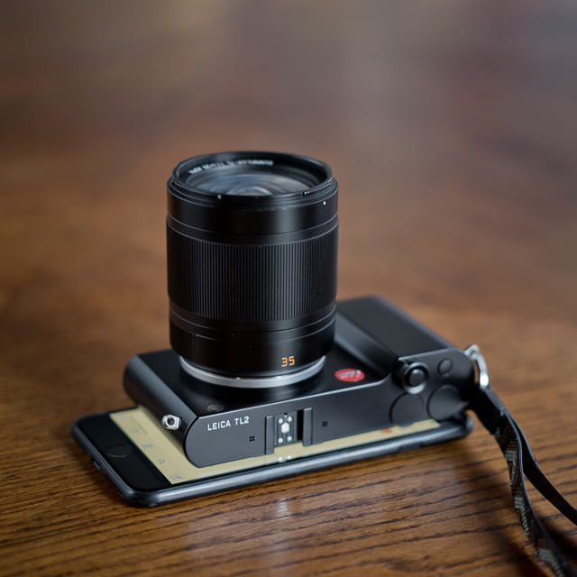
How to set the White Balance on the Leica TL2
Pick White Balance in the menu and scroll down to Greycard1 and pick the arrow > to the right.
Scroll down to Greycard1 and pick the arrow > to the right.
You now see a yellow frame in the center of the screen. Point the square towards a WhiBal card or white piece of paper (that is in the light you want to photograph in), then press set on the screen (by your thumb).
Point the square towards a WhiBal card or white piece of paper (that is in the light you want to photograph in), then press set on the screen (by your thumb).
The manual white balance has been set and stored as Greycard1. You can do the same with Greycard2 and scroll between the two.
Rememeber to go back to Auto White balance when you are done with the scene you set the Manual White Balance for.
How to set the White Balance on the Leica M10
Scroll down to White Balance in the menu. Right click with the > arrow by your thumb.
Scroll down to Greycard and right click with the > arrow.
Take a picture of the WhiBal card or a piece of white paper. It doesn't have to be in focus, it just has to be in the frame.
Now you see a picture on the screen. Move the curser (the small cross) so it is on the WhiBal card or white papoer on the picture.
Press the center button (between the four arrows by your thumb) once to get a Preview of how the changes will look. Press one more time to Save the setting.
Now the Leica M10 will calibrate all pictures taken from here to that light you just measured on the WhiBal card or white piece of paper.
Remember to go back to Auto White Balance when you walk away from that scene.
How the white balance works
What just happened was that the camera read the white paper or neutral grey and calibrated the colors of the sensor so that the light is actually white (neutral).
If the light is from a blue sky the camera will adjust out blue so that the paper is white instead of blue. If the paper was green because you are under a tree, the camera will remove green so that the color balance is white.
What to use in front of the camera to set the white balance
You are looking for a neutral grey or white piece of paper of plastic, or a white wall or a white napkin. But the best is to be prepared and have something with you that you usually use for this.
1. A piece of white something
The simplest way to set the colors right in camera is to adjust them by holding a white paper in front of the main subject and record that to the Manual White Balance setting in the camera.
It's easy to find a piece of white paper, a white plastic card, a white wall or something.
It works well, except that white is not always white. Some paper is blue because of the chemistry in the paper, other paper is yellowish. But you can get pretty decent results with it, it's better than nothing.
A white piece of paper is better than nothing. But white is not always neutral.
2. White Balance "greycard"
The method I use the most is a standardized greycard called WhiBal. It's $30 plastic card in credit card size that I can always have in my pocket (plus a few extra in my other bags).
The point that is it grey has nothing to do with it. The point is that it is neutral and doesn't contain any warm or cold colors. It's a neutral grey, and even it will take some color from my jeans or dirt from the pockets and so on, it stays pretty close to neutral.
One of the very valuable things with Manual White Balance is that you get similar colors on all pictures instead of Auto White Balance that will go up and down depending on what the camera picks up in the background.
The "similar colors" is something that is very valuable when you import a series of portraits or other photos into the computer. They are all correct or very close to final. None of them are in weird colors.
It's very easy to make accurate color photos this way.
The WhiBal credit-card size white balance card. The grey is not important, it is that it doesn't contain any colors that makes it neutral. None of the text on it has any meaning for white balance, it's just fluff to make it look technical.
Using Kelvin numbers to set the correct White Balance
Another way to set the white balance is to type in the actual Kelvin number. But you have to know it then.
Almost all cameras has a setting for White Balance where you can type in a Kelvin number. You can either guess the Kelvin number based on the fact that Tungsten light (as in a theatre or a living room) is 3200 Kelvin and daylight is around 5400 Kelvin.
For more accurate Kelvin, you would use an external Color Meter which looks very much like a light meter but measures the color temperature (and some times balance) and never works as a light meter.
Color Meters for accurate white balance
In the old days with film there was no Auto Color Balance. All film was for daylight photography, except a few specialized film types that was made for Tungsten light.
If you used any type of normal color film indoor, it would result in very warm colors. Yellow in a living room or office or a street at night. Red-orange colors if used at a evening party with candlelights.
Stanley Kubrick's candlelight lit scene in Barry Lyndon is famous for being shot using only candlelights and special-made Zeiss 50mm f/0.7 lenses. He might have adjusted the color slightly with filters, but else it is close to the actual look which is not because it is low light, but because the light from candles is warm light.
What the professional photographer would do in the film days was to correct that yellow indoor light by using a blue filter in front of the lens. The blue cools down the colors of the yellow-orange light from indoor lamps to become neutral white.
Blue Kodak CC40G filter 100 x 100 mm for filter-holder and a glass filter to screw onto the lens.
ARRi film lamp with blue filter in front of it (and also on the windows in the background if you notice).
The really professional studio photographers would use an expensive Color Meter that would measure the exact color temperature of the light and give a Kelvin number, as well a list of which color filters to use in front of the lens to neutralize the light to white.
There exist a lot of filters of different strength of color adjustment, and that was how you adjusted the color temperature of the light till we got digital sensors where you can do it electronically.
Another way to adjust the colors would be to adjust the light sources (in a studio or on a film set) by putting filters in front of the light sources so as to change the actual light.
Very few photographers ever bothered with this. First of all a lot of photography was in black and white till the 1970's and even later for newspapers. And a lot of color photography was outdoor in daylight.
With digital photography came electronic adjustment of the white balance and it became possible rather easily to adjust the color temperature.
The reason it got complicated, even it is fundamentally very simple, is that it was hard to explain; so it was easier to tell people it was Automatic.
A lot in photography is very simple, but so difficult to explain that many cameras offer Auto to deal with it.
Using an external Color Meter to measure the exact Kelvin temperature is something that interests me, just as the whole discussion about colors of CCD vs CMOS and Auto White Balance challenges my interest. I decided to get some color meters and see how big a difference it would make.
There are quite a few ways to get accurate colors. The color meters was the way to do it in the past. Today you can get more compact solutions like the LUMU Power which connects to the iPhone. My poersonal preference is the WhiBal card that has the size of a credit card and doesn't require any power. Read more in my article "White Balance for more Beauty, Part 3" here.
The Sekonic C-700 Color Meter for the patient perfectionist
The first color meter I got was theSekonic C-700 which is a sexy looking color meter with touch screen. It's about $1,499 and is powered from two normal AA batteries. I mention the batteries because so many light meters and cameras require special batteries that are hard to get when you are on location and run out of batteries! So normal AA batteries is a big plus and any gas station have them.
This is the color meter for the patient perfectionist. The reasons why is that it takes about 14 seconds to turn on: It starts by calibrating itself, and then it is ready for a reading.
Then it takes another 4 to 11 seconds to measure the color temperature, and in that period you have to keep the color meter still in the same place while it reads the light.
All in all we're talking 30 seconds to get the Kelvin temperature before you can punch it into the camera.
Is it worth the wait, you might ask.
Using WhiBal
Using external color meter
The image to the left was made with the White Balance set in the Leica M 240 camera by pointing it to a WhiBal card and was 5500 Kelvin. The image to the right is measured with the Sekonic C-700 that read the light 6098 Kelvin. I have to read the Sekonic C-700 Color Meter and do the adjustment in Lightroom (or in the camera before I take the picture). In this case I adjusted it in Lightroom.
I soon got the brilliant idea not to turn the color meter off but simply leave it on throughout a shoot. But then I realized that the touch screen is sensitive to any touch, so whenever I digged the color meter up from the pocket again, the color meter was on an entirely different screen and I had no idea if the settings had changed as well.
The Sekonic C-700 has some options for storing the readings but I haven't seen the value in learning how. Instead I will make a note on my phone or simply take a photo of the Sekonic C-700 for later reference.
The only value I in fact need from the color meter, is the Kelvin number. The Sekonic C-700 offers a lot more, and combined with the long start-up time that probably puts it in the category for film sets rather than street and portrait photography.
The Sekonic C-700 analyzes the light and gives you a readout of which colors the light has, and which color nuances are missing. It's very detailed and not of much use for me. But if I was lighting a scene in a movie, I would love every bit of it!
What I gained from this color meter was an understanding of how complicated it can be to measure and adjust colors from several light sources that are of different quality and temperature.
Which LEE filters to use on the lens
The Sekonic C-700 can also give a list of which LEE filters you put onto the camera to correct the light. If I measure a very warm halogen lamp it will come up with a dark blue filter 80A and blue filter 80C I should put on top of each other in front of the lens. That will adjust it to daylight white.
Which GEL's to use on the lamps
The other possibility, which is what you do on film sets, is to use filters on the lamps (gels). Either to balance the lamps, or to create effects. If you are filming in an office, then you set up a big daylight lamp outside the window to send in daylight to the room (or a Tungsten lamp with blue gel in front of it). Inside the room you have some lamps, and those you adjust to look like daylight, or perhaps a little warmer so they look like lamps does to the eye (but without adding too much warm light to the set).
My notes; I simply shoot the Sekonic and apply the Kelvin in Lightroom. (I read the light from the window and held the Sekonic so I could shoot the screen):
Kenko KCM-3100 Color Meter for fast external Kelvin
Like the Sekonic C-700 it uses normal AA batteries.
This is a very simple color meter to use if what you aim to get is simply the Kelvin number. Which it is for me. The start-up time is less than a second, and the reading is less than a second as well.
It feels very much a light meter in terms of handling and speed. It feels great with a slightly rubbery surface that gives a good grip, the weight is exactly right (not too plastic, not too heavy).
This color meter is the one I would use for street, portrait and reportage.
Shipping June 2017, the LUMU Power ($298) will be both a light meter and a color meter for the iPhone.
The Lumo Power color meter ships worldwide and comes in this nice box.
Video tutorial of how to use the external color meter
I've made this simple video showing how to set the color temperature using an external color meter.
What I really learned from color meters
One thing I learned is that color metering might be complicated, but it isn't an exact science. The results vary from one method to the other ... and that doesn't matter that much.
What matters is that you lock your color temperature.
I found both color meters warmer than what I usually like, but I actually also find the WhiBal results is warmer tones than I personally prefer.
But when I test the results on others, they prefer the warmer tones.
What I do know is that color temperature preferences change from country to country. Just look in magazines. In Scandinavia we prefer cool tones. In the US they prefer warmer tones.
Obviously, the neutral white daylight temperature would be different for an American look vs a Scandinavian look.
So you have to use the tools to get the neutral look; and from there you add your artistic twist. Warmer or colder.
But here is another thing I learned from it: When you walk around with a color meter and notice the actual Kelvin temperatures, you learn what the shadow approximately will be, what a reflection of sunshine into a shadow will be. You realize how the Kelvin changes throughout the day and how it changes when it rains.
But one thing I learned that I really value is that I realized how fast the Kelvin changes if I move my hand or rotate the meter slightly. Even if I don't do anything, the Kelvin changes in the same spot from one moment to the next.
In other words, not reason to get a headache because the Kelvin changed 100 Kelvin or even 500!
It doesn't go from 5600 to 6100, but it may go from 5350 to 5500 from one moment to the next without anything actually changed. If a cloud goes over the sun it may drop significantly , but that is something you can see with your eyes.
A color meter teaches you to see. And it teaches you that no matter how precise an instrument or method you use, the light will change slightly even nothing happened.
There is a limit for how precise you can get it outdoor. In a studio or on a film set where nothing changes you can measure very precise and nothing will change.
This minor changes is something you have to live with. It doesn't change the colors dramatically.
The WhiBal card ($30) and the Sekonic ($1,600) and the Kenko ($800) Color Meters get somewhat the same results in Kelvin numbers.
The WhiBal is compact, economical and easy to use. But it doesn't give you a number on the spot. The camera just figures out the neutral white balance (and you can see later in Lightroom what the Kelvin value was).
Not a big question what I will always have with me and what I will occasionally use. The WhiBal is great.
I will say I learn a lot from using color meters, but in travel I will not bring them unless I know I will have to use them.
Manual White Balance is so simple that even if I lost my WhiBal card, I could use a white piece of something and get pretty close to the final colors.
On the iPhone you can get Lightspectrum Pro which measures the color temperature based on reflections of what the iPhone camera is pointed towards. This means that if you want an somewhat accurate measurement that is more precise than what the camera’s AWB will get, you have to point it at a white balance card or some other neutral surface (white or grey).
I find it troubling that a rather simple application for the iPhone is made as complicated as is the case (which to me indicates that the ones who made it doesn't use it but are more programmers than photographers). The app gets a 1.5 stars in overall of 59 reviews in the App Store, which I guess is fair: Complicated, no instructions and random measurement results.
LUMU is supposed to come out with an App in late 2015/early 2016 that will make their lightmeter into a color meter as well. Provided they simplify their lightmeter App I would be interested, but currently their App is much too complicated to be used (they have promised to make a new simplified one). But a lightmeter and color meter in one ... that is a good idea.
Why use an iPhone to measure something the camera can measure. If you didn't bring the camera, you won't need the Kelvin anyways.
Measuring Kelvin and getting a headache
One of the troubles in measuring color temperature in Kelvin is that you will see immediate change whenever you move the device a little, as well as measurement from one minute to the next. That’s how it is if the light source is available light and therefore it has a lot to do with confidence in the tool you use.
You got to make a decision in one direction or the other, and consistency is more important than anything else: It’s better to have a consistent white balance setting than one that changes from photo to photo.
If I get back to the computer with a handful or two hundred photos from the same location, I don’t want to judge every photo individually in Lightroom. Which is what you will have to do if you used the cameras Auto White Balance. It will not be consistent but will react to any strong light source/light reflection in the background or foreground.
Also, the main subject and not some random surface in the frame is what you want to get correct colors on. This is the reason why you would use a color meter or a WhiBal card. The color meter measures not the refection from a surface or subject, but the exact color temperature in front of the subject (when you hold the color meter in front of for example a face and measure with the white bubble facing away from the persons face).
With a WhiBal card you are use the camera's built-in color meter to measure reflections from a surface, and that is why you use the WhiBal in the first place.
For that reason it is important to hold the WhiBal card in front of the main subject in the picture, facing towards the camera while you make sure it is not picking up a reflection from the sky or the card reflects for example strong sunshine behind you.
Measuring white balance (and light for that matter) is not an air sample. You actually have to make sure you hold the WhiBal card correct in front of the subject so what the card picks up the light that falls onto the subject from the side you are photographing.
What's up with Kelvin and Adobe?
A problem with Kelvin values is that camera producers, manufacturers of color meters and Adobe Lightroom don't seem to use a common standard.
The Kelvin number you pounced into the camera manually - say 5400 - shows up as another Kelvin number in Adobe Lightroom. Which leads to the obvious question: What if I don't punch in the Kelvin number in the camera but make a note so that I can punch it into Lightroom later?
Will it be the same? Most likely not.
If I punch the Kelvin number into the camera, will it be accurate in my camera compared to another camera model? Most likely not.
Let me just say that there is a LOT in color management that is VERY confusing. Which is a reason to keep your color management as simple as possible.
Most of the stuff you read in descriptions is more marketing hype than actual knowledge.
The short conclusion is that nobody really know what they are doing. They depend on Auto for a great deal of the work. Except the ones who work with color management in the field and have found a way to make it work.
Find something simple that will actually work in what you do.
You have to select a method and decide that this is how you find your way to the colors you like. Don't expect a machine or software to do it for you.
The Santa Fe colors, January 2015. The light comes from a low angle most of the day, creating very interesting long shadows on walls and streets. But also note that the sunshine is warm light, the shadow is ice cold. Leica M 240 with Leica 50mm Noctilux-M ASPH f/0.95.
Mixed light sources and white balance
As you can easily imagine (and measure with a color meter), the light that falls on a persons face might very well be different than the light reflection that hits the top of the persons head. You expose for the main light that hits the face and can’t worry to much about stray light.
If you have a person who’s face is hit by for example tungsten light on the right side of the face and natural daylight on the left side of the face, there is no way you will ever be able to get correct colors. That face will always look a little sick and will never get a really healthy skin tone, not even if the person is beautiful, smiling and healthy.
You cannot white balance different light sources into one color temperate in the same photo.
I know they told you in the photo store that this new Maximus 8008 RII Platinium XXLprocessor reads 800 spots and works it all out in 64bit.
But it will never be able to mix two color temperatures into one.
All you do with white balancing is to make any light source look neutral white light. This is what give she natural aesthetics to a photo, but the light you balance or adjust has to be one temperature.
The view over Central Park in New York at sunset. You can easily tell the warm sunlight from the cold shadows, plus reflections of the cold water to the sky and back down. Leica M 240 with Leica 75m Summilux-M f/1.4.
I tell you that the camera only can do global adjustment of the whole image at one time. If the camera adds warmth to an image, then if part of the image is already warm light, that part will only get warmer.
What you can do some times is to reduce one of the light sources. Usually when I photograph interiors or inside I turn off the light in the ceiling and the room so the whole space is lit by available light from outside.
The other possibility is to close the blinds and rely solely on the inside tungsten light or fluorescent light sources.
But you make sure you only have to deal with (adjust) one type of light. That’s how you do it.
With new types of light you will be faced with things that you don't understand, as well as things you understand but cannot do anything about.
Look here, this strange revival of The Dress we experienced in Los Angeles. On our way to a a red carpet event and I took a photo of Joy in the parking space with the Leica M 240 and the Leica Cine 100mm Summicron-C f/2.0, and later I shot some of the red carpet event that was lit with Tungsten lights (2700 - 3200 Kelvin).
Street light in Los Angeles Kelvin 5333, Tint +150.
Tungsten light on red carpet, 2700 Kelvin, Tint -5.
When I showed Joy the pictures, she didn't see it first. She actually thought the colors looked like they were. But it is evident when you look at the two pictures that they are not. One of them are wrong.
The Tungsten lit picture to the right is the correct colors. The light source(s) in the picture to the left is messing with the red and pink colors of the shirt and the flowers in the hair, the lips and makeup.
Frankly, here we have something I don't understand. I may go back to the location next time I am in Hollywood, but for now I can only compare the EXIF data on the files.
The picture to the right is no mystery. The skin tones and all is pretty much where they are supposed to be.
But ... the picture on the left! There is no way I can get the skin tones right, and wasn't it for the obvious misalignment in the other colors, it would be easy to blame the sensor in the camera.
The Tint can't go further than +150 in Lightroom, and it's more then just unusual that it is that far up. Some times you will see Tint at plus or minus 30, but mostly plus and minus 0-10. The Tint at +150 gives an idea that something extreme is at play.
Most likely it is a sort of LED light that is the main light source, whereas the background light is Tungsten light.
The obvious change of red and pink (and orange and yellow) colors in the photo will of course affect the skin tones which consist of a large amount of red and orange.
In other words, there is no way you can ever get the right skin tones (or any other tones) right in this type of light.
LED light on stage and in life
Stage light can be many things, but there is supposed to always be a key light (main light) that is white light.
Theatre uses colored light to create atmosphere and to create the illusion of space. They can do amazing things that creates a make-believe that the stage is actually under an open Arabic sky with stars and all. But if you notice, there is almost always a white key light from the front (of the stage and above the stage from the front) to make it easy to see the actors.
In music stage lighting it is less artistic and skillfully used to to create space and is mainly used to create the illusion of movement and action. But again there is usually a white key light from spots above the front of the stage, or a follow-spot.
Canadian singer-songwriter Neil Young, Leica R9/DMR with 80mm f/1.4 @ f/4.0, 400 ISO, processed in FlexColor.As you can sense, the key light here is correct (and the colored lamps behind him are Tungsten lamps with colored filters in front of them).
Key light will work really well for photography. All you have to do is to set the Kelvin to 3200 (Tungsten) and the skin tones will be ok. The background light and other effect light will usually be the color it is supposed to as the light effects are made with Tungsten lamps with a color filter in front of them.
It's almost as the light in your living room. Good old Tungsten light on Danish singer-songwriter C. V. Jørgensen. Leica M9 with Leica 90mm Summarit-M f/2.5.
But ... that all changed with LED light. For many reasons LED light is a super cool idea for everything that has to do with stage light: It's light-weight to travel with, it's low-energy, it is low heat and the LED lamps lasts for a very long time and need not to have their bulps replaced.
The problem with LED light is that they usually have very high Kelvin values. To the eye the light looks white, so the audience and actors are happy and nobody notices anything. But for the camera the light is out of scale.
It looks amazing, but it's terrible for photographer. A flood of LED light in blue! There is no chance you will ever be able to balance this to white light. I set the Kelvin to 3950 in this one: The skin tone on the face of Mike Sheridan by the computer is as close as you will ever get to anything that looks like a skin tone. But it is so far out of of the Kelvin scale that if you adjust the white balance in any direction, the picture disappear. It's like a thin slice of ice-blue light you can hope works in camera but with almost no chance to balance it to any side.
When you photograph concerts in LED light the majority of the photos will look really weird on the computer. It looked like white light when you took the photos, but when you get home to the computer you realize it is all LED light and none of the colors are right. The blue or red light from the side make the side of the singers face disappear.
Thankfully - or hopefully - a few of the photographs will look cool as they are. Like the above which is one of many photos, but unlike the majority of photos you can actually see the shape of people. Most of the others, it's one blue flood of light with a head here and a leg there. If you look closely at the picture above you can sense how the table is basically half gone!
The maximum Kelvin scale for digital color photography
The Leica M 240 and Leica M-P 240 can be set to Kelvin values from 2000 to 13,100 (the Leica SL 601 it is 2000 to 12,500) and LED light sources will often be above 13,100 Kelvin. In other words, you cannot white balance for them, even if you noticed that the white key light is not Tungsten based but LED based.
Without being an expert on the matter os sensors, to my knowledge digital sensors are able to work with accuracy within a Kelvin range from 2500 to 12500. They will be getting better, but this illustrates one problem you have when the Kelvin (light temperature) is below or above the scale.
The problem with white key light from LED lights is that it is not Tungsten light (2850 - 3200 Kelvin) or daylight (5400 Kelvin) but something else. As in this example where there is in fact white key light ... except it is LED light around 6500 Kelvin.
Believe it or not, when I imported the photo below into Lightroom I thought it looked ok (the one to the left). After adjusting it I realize it is LED key light and the temperature is very off on all photos. And even when adjusted as much as I can, I can still tell it is not a neutral skin color I got. That's what LED light does to your pictures. It's not balanced.
Even when you adjust for it, you cannot get the exactly colors right. It's like there is an unbalance.
And you are exactly right in that. Here is why:
Cheap Fluorescent (no red)
The quality of light lamps provide is not a standard. That goes for all types of light. But LED is made in China and all other places, and in many qualities without any standard for color temperature.
For some reason LED lights follow many different patterns and color temperatures. After all, the main reason to produce and use LED light is because it is low energy, low heat and last for a long time. LED light was not invented to make you some great light for color photography.
Cheap Fluorescent light where the red is missing (as seen on the screen of the Sekonic Color Meter C-700). If you imagine that the inability to see red is the cause of colorblindness, then what happens to the colors when the red is in fact missing in the light source?
"Cheap Fluorescent" is an expression for light where the red color is missing. In fact, light sources can be measured with a color meter like the Sekonic C-700 to see exactly what their light consist of. This is an expert tool and can measure every single light source in a film set and apply filters on the light to get it all in balance.
Ideally all types of light would be high quality and consist of a balance of the colors. But in reality lamps differ in not only Kelvin value (light temperature) but also the mix of colors that make up that light.
So if you some times wonder why you can't get exact colors even you do everything right, there is one very good explanation.
Mixed cheap LED light sources,
blinking red lamps and candle light dinners
If you visit an Indian restaurant (which I often do because I love Indian food), their lighting techniques will often be as mixed as the spices they use. There will be LED light made by many different manufacturers, and there will be a mix halogen lamps, energy saving light bulps and different Fluorescent light sources.
The problem with understanding light for humans is that our eyes adjust for color temperatures. You can train your eye to see that some light is blue, some is warm orange, some if green, etc. But you only sense a small difference.
For the camera the differences is extreme.
When you visit an Indian restaurant, the best is to order extra nan brad and concentrate on enjoying the good. Set the camera to black and white, or simply leave it on the table and enjoy the food!
Between us, I don't think highly of flash lamps
I find that studio flash light is mostly out of tune with color balance. I know this will get a few manufacturers of studio flashes jump up their chair, and likely a few million photographers who have invested in expensive radio-triggered flash lamps, driven by expensive mobile batteries and parked with sandbags on heavy tripods.
But between us, I have never seen flash light that made really clean natural colors.
You can adjust it, but even then you can't get the same quality as the light the gods make available for free every day and everywhere during the daylight hours.
In my view, flash lamps ranks as important for photography as photo wests.
Now that I have spoken greatly about accurate and neutral colors, let me speak a little of departing from all than and enter into artistic use of colors.
All I ask is that you control the colors, and the starting point is to know how to get them right (neutral). From there you may depart to warmer or cooler colors, or even mix them up.
Just like I try to achieve my own look in black and white, I try to achieve my own look in colors. In my case that ideal is close to clean neutral colors. Not saturated. Not de-saturated.
Others might find another look pleasurable.
Steve McCurry is a great example of creating your own color look. His colors are generally "very colorful" which aligns with India and other exotic locations, as well as the adventure that is usually the message in his photographs. In his case the colors were defined or found when he used film. Hence his look comes from a choice of film, method of developing as well as the darkroom work that pointed to a certain type of photo paper. In the digital age he have had to create a workflow that would give him that look from the sensors and digital workflow. It's very Steve McCurry.
Movies generally choose a color spectrum for the overall movie or scene, and they are seldom neutral colors. So that is worth looking at and getting inspired from.
It is also an inspiration in the sense that movies use big budgets on lighting and getting it right. And then they basically apply grading to it all i the final post-production (which basically is a sort of high-end Instagram effects).
The colors of movies are often determined by the use of lenses (and their look/coating), the film or sensor/camera used, locations with certain light conditions, filters on the lens and/or the light sources, and finally grading in the lab/computer of the whole movie.
A scene from Wim Wenders "Until the End of the World", 1991.
A scene from the Berry Lyndon movie with adjusted colors, though slightly use of mixed light (warm light from the left and blue daylight from the right).
Departing from the neutral colors
It's your artistic choice to depart from the neutral colors you obtained. Depending on what you want to tell with the picture.
It is also a fact that the early morning is in fact cold blue colors till the sun comes up, and when you adjust to neutral colors, you adjust to daylight colors. But the scenery you photographed was not daylight but cold blue morning light. So that is an obvious artistic adjustment you can decide to make, or not to make.
When I used the Leica M9 in 2009, the cameras auto white balance in the first firmware versions wasn't that great or accurate. So I would set the white balance manually.
Because I had to control the white balance, I would set it manually for outdoor photography, well knowing that the shadows are colder than the sunshine. I know I can't get both the sun and shadows in daylight colors.
In for example LA I would set the white balance for the shadows which would result in neutral colors in the shadows and warm colors in the sunshine. The temperature is set for the image globally, so when the shadow temperature is warmer, the sunshine will be warmer too. I made that artistic choice because it would look good with neutral to warm colors in LA, whereas daylight neutral colors in sunshine and cold blue colors in the shadows would not be the look I wanted.
The cameras have gotten better at Auto White Balance. What the camera does is picking a spot in the picture that (according to the cameras limited intelligence) looks like a neutral white or grey surface, and then adjust the overall photo based on that spot.
Often it gets very close, some times there is no spot or the closest spot to neutral isn't neutral. That's when the colors gets wrong.
When I walk about in a city with the Leica M 240, I set the camera to Auto White Balance, and only when I want to make a precise color photograph, I set the white balance using either a WhiBal card or an external color meter.
Portraits or interiors, or simply a photo where I want the colors to be accurate, I set the Manual White Balance.
A park with lots of green is an obvious example of where the cameras Auto White Balance most likely will fail and it will be a headache figuring out the exact right colors later. So in that case as well, I set the Manual White Balance.
If I was to define a rule, it would be, "If you want accurate colors, take charge and set the color balance yourself."
It can be a challenge to find good light in the streets for the type of things you want to do, even i black and white.
The challenges for color photography is to find both the right balance and mix of colors that will support the message and aesthetics of the photograph, as well as the sparkling magic light.
It's easier to find the light first, or look for the light first, then the colors. In my opinion.
Colors change in different light, and in the context they are seen. With a Monochrom camera you can look for light and tones, with a color camera and the intention to make something colorful and aesthetic, you got a lot more on your plate.
That's why it is fun ... or depressing. Depends how it works out.
It's a humorous understatement to call this
new eBook by Thorsten Overgaard for "A Little Book on Photography".
It's a grand book, a history lesson, life experience, a biography and poetry book and brilliant photo book!
All in one beautiful package of 180 pages
to fire you up and get you to love
photography ... unconditionally!
"A Little Book on Photography" eBook for computer, Kindle and iPad.
New release March 2017.
Intro price only $47- 180 pages.
Buy Now
Instant Delivery
Sensors and colors
When we go from color film to digital color sensors, there are certain colors that become invisible. Modern lenses "made for digital cameras" are lenses made to optimize what the sensors actually can see. The invisible colors also leave room for improvements in lenses - or shortcuts - that would not be possible to make for film cameras without revealing other flaws.
It's a subject some are experts on, and I am certainly not one of them.
But what is visible to all of us who aren't in on the wavelengths of light and how that relates to sensors vs film, is that for red often causes a problem in digital photography. It's just a hard color to get right.
Color photography and lenses made for digital sensors
Some colors are worse than others. You can tell that most digital sensors have trouble with reproducing red (ironically the eye can have trouble with red too), but generally the world looks different after we started using digital sensors.
If you ever wondered why lens producers started making "lenses for digital photography" that is the reason. The ability of a sensor to record colors is different from chemical films recording of colors.
While I don't know what a cheap lens "enhanced for digital photography" does, I do know a little bit about high-end still lenses and cine lenses.
The digital sensor has certain wavelengths of light it just can't see, and this has opened up for both the possibility to "hide" certain effects, but also opened a need for glass and coatings that bring colors back on track.
In modern lens production, coating of lenses is used to control not only the level and type of reflections inside a lens, but also to get skin tones and other color tones accurate and pleasant.
Without lying too much I would say that design of high-end lenses is centered around skin tones. The Leica Cine lenses project was started when movies were made on film, but then the whole design of the lenses had to change as more and more movies are made with digital sensors. They were planned as film lenses but ended up being digital lenses. Keep an eye out for my update of my Leica Cine lens article for more on the look of cine lenses.
If you own some older Leica M or Leica R lenses this might make you wonder about the difference between using a "film" lens and a modern "digital" lens.
If the quality of grinding, engineering and glass used was the same, and maybe most importantly, the precision in grinding and assembling, I am sure we could do some interesting tests.
But the fact it that old and new lenses look different in everything, including colors. The differences comes from so many parameters that it is hard for us to make a "homemade" comparison that would display the exact changes in what digital sensors vs film make out of colors.
Deciding if a lens is appropriate or good for digital photography is quite simple. It is simply a matter of looking and deciding if you like what you can make with it. The marketing hype of course have tried to give the impression that lenses needed to be "enhanced for digital photography" or the world would cease to exist.
Lenses are not like an App on your smartphone that will stop working if you don't update it. The lenses will work forever.
My 1964-model Leica 50mm Summicron-M f/2.0 on the Leica M 240. It's not easy to tell it wasn't optimized for digital photography, though I know it's weak points in color (strong light from behind) and it's strong points. It's not as accurate in color details as optimized for digital lenses from Leica today ... but it's still a very good lens.
So how does it look? My old 1964-model of the Leica 50mm Summicron-M f/2.0 Version 2 "rigid" was and is terrible in handling reflections in certain bright scenes. This would some times make it unusable for great colors, but in many other cases the colors were a little soft or dull but could be brought to look perfect with a few adjustments. Mostly contrast. I've used it a lot for color photographs.
The modern Leica 50mm APO-Summicron-M ASPH f/2.0 is a complete different story in terms of handling colors in almost any type of photography. The modern lenses are very accurate, from the micro details to the overall look.
Interestingly I find that the Leica 50mm Summicron-M f/2.0 from 1964 that in essence is terrible with digital color photography makes some strong monochrom images, whereas I personally sense that the 50mm APO makes monochrom photography to hard (literarily) to make in terms of getting soft bright tonal range. The Noctilux is better for monochrom photography than the 50mm APO.
Which of course in my world opens for the interesting question if "monochrom optimized" lenses would make any difference, if they were made?
When some say that they like the "film look" of for example the Leica M9 sensor and we talk about "Japanese colors" of other sensors, it is most likely not something we made up.
There is a difference in sensors from one type of sensors (CCD) to another (CMOS), but certainly also from generations of sensors. They have changed over time, and they will keep changing.
Film did the same if you remember, and quite a lot. Over the years color film photography changed a lot, and within the same year there would always be different looks achieved from different types of film from the same brand. Fuji would have film that made really accurate skin tones, and others where the skin tones were red and orange, the color of the grass like freshly made plastic and the sky so blue it reminded us of the first days after the universe was created.
I see a change in my first Leica M 240 color photographs to today. And I see a different style in my two-years-experience photographs from my Leica M9 images to my two-years-experience from my Leica M 240 images.
When I did film it had a certain look. When I changed film scanner, the look changed. It always gets better with experience.
And never did I feel an urge to go back to a previous or older technology. I firmly believe that whatever comes, I cam tame it and get it to work my look.
Buy my Lightroom Survival Kit 6 for more on this
I hope this was helpful. You can learn more on this and other ways to get the right workflow in my Lightroom Survival Kit:
The Lightroom Survival Kit 6 contains sections that are easy to understand and use on White Balance in Lightroom, as well as many other subjects to "survive Lightroom" and improve the overall quality of photography.
"Check battery age" message after 3 years
The Leica M 240 and Leica M-P 240 was described as communicating with the batteries when introduced. Expecting that this meant the camera would measure and perhaps diagnose problems and/or percentage of strength in older batteries, it is a little disappointing that all I have gotten from this has been the bright red message "Check battery Age" on the display when I press INFO.
"Check battery age" is a mesasge tricked by the age of the battery and nothing else. It has nothing to do with the battery's actual performance.
It has nothing to do with the actual performance of the battery, and not even the number of cycles it has been charged. The message will activate approximately 34 months after the battery was produced.
You can see the production date on the battery, the white field with black letters in the down left corner. 0213VB for example means that the battery was produced week 2, 2013.
The 0213VB on the batteri means it was produced in week 2, year 2013.
Changing camera date will remove message
You can set your camera's date back a year or two and wil lnow see that the message disappears. When you set the date back to present time, the message will re-appear. So that is what the message tells: The battery is three years old.
I hope you enjoyed this tour-de-force in color photography. I will try to make a page about editing and workflow of color photographs to follow this one.
As always, feel free to e-mail me with questions, suggestions, ideas and all.
1:2/50 the description says.
But what does it mean?
1: = Basically means 1 divided with. On the lens to the right, it means that the diameter of the hole throught he lens is 25mm.
We would normall call it
a 50mm f/2.0 lens. The writing of 1:2/50 is a tradition from the 1800's of specifying a lens, which reveals quite a bit about the construction: Focal length 50mm simply means that the distance from center of focus inside the lens to the focusing plane (the sensor or film) is 50mm, and the aperture of f/2 or 1:2 means that the diameter of the hole the light comes throught is 25mm (50mm divided with 2 = 25mm).
In traditional lens design, one could usually tell from looking at the length of a lens if it was a 400mm, 100mm or 35mm. Newer designs with mirrors (in tele lenses) and more corrections (in wide lenses) can make the size of the lenses shorter or longer, but the distance from center of focus to sensor in a modern 50mm lens will still be 50mm for a 50mm and 400mm for a 400mm, and so on.
See Focal length and Aperture further down for more.
35mm
a) 35mm lens is a lens that has a viewing angle of view is 63°vertically, 54° horizontally and 38° vertically within a 35mm film frame or "full-frame" 24x36mm digital format. See Focal length further down.
b) 35mm focal length: the distance from center of focus inside the lens to the focusing plane (the sensor or film) is 35mm.
35mm film format (also known as full-frame)
c) 35mm film format (also known as full-frame in digital sensors) was a standard film format that came about in 1892 where the width of the film roll was 35mm, and it's been the most used format ever since. Only a format of 24 x 36mm is used for the photo on the film roll.
35mm film format was first used in 1892 by William Dickson and Thomas Edison for moving pictures with frames of 24 x 18mm, using film supplied by George Eastman (Kodak), and this became the international standard for motion picture negative film in 1909. Later other motion picture formats came about, such as Academy Ratio (22 x 16 mm), Widescreen (21.95 x 18.6 mm), Super 35 (24.89 x 18.66 mm) and Techiscope (22 x 9.47 mm).
The inventor of the Leica camera, Oskar Barnack, built his prototype Ur-Leica in 1913 as a device to test film stock and\ motion picture lenses and had it patented. Putting 35mm film format into a small camera gave him the idea "small negative, large print" and he decided to increase the size of each frame on the 35mm film to 24x36mm (for more detail and sharpness), and then invented an enlarger to make large prints from the small negative. The length of a film, 36 pictures, is said to have become the standard because that was how far Oskar Barnack could stretch his arms (when cutting film from larger rolls to put them into film rolls for the Leica camera).
d) 35mm equivalent is often given as a standard when talking about lenses in small compact-cameras or large format cameras with other sensor/film format than the 24 x 36mm frame. Example: A camera with a 12 x 18 mm sensor has a 14mm lens on it, and even the lens is actually a 14mm, it is specified as a 28mm lens because the viewing angle that ends up on the sensor is equivalent to a 28mm lens on a 35mm of full-frame camera.
The Leica 50mm APO-Summicron-M
ASPH f/2.0 lens
50mm
a) 50mm lens is a lens that has a viewing angle of view is 47° vertically, 40° horizontally and 27° vertically within a 35mm film frame.
b) 50mm means there is 50mm from the center of focus inside the lens to the focal plane (sensor or film).
c) 50mm lens is often compared to the human eye. Not because of viewing angle (how wide it sees) but because of size ratio (how it sees). The 50mm lens is the lens that comes closest to the size that the human eye see things. Whereas the human eye has a much wider angle of view [120-200°] than the 50mm lens [47°].
AF = Auto Focus. The idea is that the camera does the focusing itself (the word auto comes from Greek "self").
Aperture = The same function as the iris and pupil has in the eye. The pupil in the eye is the dark circular opening in the center of the iris of the eye, varying in size to regulate the amount of light reaching the retina (the sensor area inside the eye).
Aperture on a camera is the f/ stop on the camera that regulates how much light passes through the lens by increasing or decreasing the hole through the lens. On a f/2.0 lens the lens is fully open" at f/2.0. At f/2.8 the aperture inside the lens make the hole through the lens smaller so only half the amount of light at f/2.0 passes through. For each f/-stop (4.0 - 5.6 - 8.0 - 11 - 16) you halve the light. The aperture of the lens is basically the focal length divided with the f/-stop = size of the hole (50mm divided with f/2.0 = the hole is 25 mm in diameter).
Besides regulating the amount of light (so as to match the correct exposure), the aperture also affects the dept of field: , which is how deep the sharpness is. To get the sough-after photos with narrow depth of field where the background is blurry, the lens has to be wide open at f/2.0 or so. Stopping the lens down to f/8 or f/16 will result on more depth of field, meaning the background will start becoming in focus. To maintain narrow depth of field, one can use the ISO sensitivity and/or the shutter speed to match the correct exposure (as aperture is only one of three ways to control the exposure; the correct amount of light). ORIGIN: Late Middle English : from Latin apertura, from apert- ‘opened,’ from aperire ‘to open’.
Aperture Priority Mode = When the shutter speed dial on top of a Leica M camera is set to A, it is short for “Aperture Priority” and allows the user to set a specific aperture value (f-number) while the camera selects a shutter speed to match it that will result in proper exposure based on the lighting conditions as measured by the camera's light meter. In other words, you set the aperture as priority (f/1.4 for example), and the camera calculates a shutter speed (1/250 of a second) that matches that. If you change the aperture to f/2.0 by changing the aperture ring on the lens, the camera will re-calculate the speed to 1/125 so as to get the same amount of light to hit the sensor (f/2.0 is half the light through the lens as f/1.4 and 1/125 if twice the amount of light on the sensor as 1/250).
APO corrected basically means that the red, green and blue has been corrected to meet more precisely in the same spot. Clarity of colors and definition of details would be the result.
APO = in lens terminology stands for "apochromatically corrected". In most lenses, optical design concentrates the focus of blue light and green light into a single plane, but red light falls slightly into another plane of focus. In APO lenses, the design and expense has been put in to making red light focus on the same plane as blue and green. Under a microscope you would see that all light subject is now in focus, creating a sharper image overall. Many manufacturers offer APO designs, but in most of these only the very center of the lens is APO corrected. Leica prides itself on making most of the frame APO corrected.
APo-correction has traditionally been used for long tele lenses (and periscopes), but in recent years APO-correction has been applied to 50mm and wide angle lenses as well. One will notice that the colors are really bright and alive, almost more real than to the eye, in lenses like the Leica 90mm APO-Summicron-M ASPH f/2.0 and 50mm APO-Summicron-M ASPH f/2.0.
Apochromat; ORIGIN early 20th century, made of the two words; apo (Greek origin, away from) and chromatic (Latin origin, meaing relating to color).
spherical (ball)
a-spherical (non-ball)
ASPH = (Aspherical lens) stands for "aspheric design".
Most lenses have a spherical design - that is, the radius
of curvature is constant. These are easy to manufacture by
grinding while "spinning" the glass. This design
however restricts the number of optical corrections that can
be made to the design to render the most realistic image possible.
ASPH lenses (a-spherical, meaning non-spherical), however, involve usually 1 element that does
*not* have a constant radius of curvature. These elements
can be made by 1) expensive manual grinding, 2) molded plastic,
or 3) Leica's patented "press" process, where the element
is pressed into an aspherical ("non-spherical")
shape. This design allows Leica to introduce corrections
into compact lens designs that weren't possible before. Practically,
the lens performs "better" (up to interpretation)
due to increased correction of the image, in a package not
significantly bigger than the spherical version.
There is another Aspherical lens manufacture technique: an uneven coating layer is applied to a spherical lens. The coating is thicker on the edges (or on the center, depending). Canon "Lens Work II" calls these "simulated" aspherical lenses. Simulated and Glass-Molded (GMo) asphericals show up in non-L Canon lenses, while the L lenses have actual ground aspheric elements.
A- means non, or without.From Latin, ex. Sphere: ORIGIN Middle English : from Old French espere, from late Latin sphera, earlier sphaera, from Greek sphaira "ball".
Normal spheric lens (grinded)
ASPH (note the shape of the glass as result of pressing rather than grinding)
Auto- means “self”. The idea is that when a camera has auto-(something), it does that (something) by itself.
Banding = Noise in digital images. Horizontal lines in a horizontal picture (if the camera is in portrait mode/vertical, the lines will obviously be vertical). It's simply noise; the result of uncontrolled algorithms working overtime with an image the sensor really can't see because it's very dark. (If your image has vertical lines in it, it is more likely that the sensor needs remapping).
This image at 6400 ISO, underexposed and then brought up to correct exposure in Lightroom, displays banding: Horizontal lines in the image. Leica M-D 262 with Leica 50mm APO-Summicron-M ASPH f/2.0.
Base ISO = The ISO the digital sensor was born with. Even a digital sensor goes from say 50 ISO to 25,000 ISO, it only has one base ISO. Any other setting is an algorithm that figures out how the image whould look if there was 64 times more light, or half the light, etc.
When you go down from Base ISO (for example 200 to 100 ISO), you can expect a
decrease in quality. When you go up, the decrease is much less. For some sensors, you loose 2-3 stops by going down 1 step in ISO, but can go 8 steps up and only loose 1 stop in dynamic range. Basically, your ISO range should be from Base ISO and as far up as you can, before you see visible decrease in quality (mostly 3200 ISO - 6400 ISO).
Base ISO for Leica M9 is 160 ISO, for Leica M240 it is 200 ISO. For Leica M10 it is around 160 ISO. For Leica M Monochrom it is 320 ISO. For Leica Q and Leica Q2 it is around 100 ISO. For Panasonic Lumix S it is 200 ISO. For most Canon cameras the base ISO is around 100, for most Nikon cameras it is around 200 ISO.
Bokeh = The visual quality of the out-of-focus areas of a photographic image, especially as rendered by a particular lens: It's a matter of taste and usually photographers discuss a 'nice' or 'pleasant' bokeh (the out-of-focus area is always unsharp, which is why the quality discussed is if one likes the way it renders or not by a particular lens). The closer you get to something, the 'more' bokeh' you get (in that the focus becomes less for the background and foreground at close distances than at long distances). ORIGIN from Japanese 'bo-ke' which mean 'fuzzines' or 'blur.'.
C = Continuous shooting. When the ring by the Shutter Release on top of the camera (or in the menu of digital cameras that doesn't have such a feature on the outide of the camera) is moved from OFF to C, the camera takes series of images as long as the shutter release is pressed down. In some cameras the speed of continious shooting can be adjusted.
Camera comes from Chambre, mostly in relation to Spanish soldiers’ rooms. Obscura means 'dark', so a dark room is basically the derivation for the word camera.
Camera -is today’s short name for Camera Obscura (meaning “a dark room”). CamerameansChambre and was used only as a Latin or alien word, actually only for Spanish soldiers’ rooms, until popularized in connection with photography in 1727: “Camera Obscura”. In 1793 the slang term “camera” was used by Sterne Tr. Shandy: “Will make drawings of you in the camera” and by Foster (1878), “The eye is a camera”. Camera Obscura was described by Iraqi scientist Ibn-al-Haytham in his book, “Book of Optics” (1021) and by Leonardo da Vinci in 1500; popularized and made widely known in 1589 by Baptista Porta when he mentioned the principle in his book “Natural Magic”. Johannes Kepler mentions Camera Obscura in 1604.
Camera = chambre (room), Obscura = dark (or cover).
Why is it called a "camera"..?
The word Camera is today's short name for Camera Obscura (which originally means “a dark room”).
Origin of the word Obscura means "dark" or "covered", and the word Camera meansChambre and was used originally only as a Latin or alien word, actually only for Spanish soldiers' rooms, until popularized in connection with photography in 1727: “Camera Obscura”.
In 1793 the slang term “camera” was used by Sterne Tr. Shandy: “Will make drawings of you in the camera” and by Foster (1878), “The eye is a camera”.
Ibn-al-Haytham mentioned Camera Obscura in his "Book of Optics" in 1021.
The concept of Camera Obscura was described by Iraqi scientist Ibn-al-Haytham in his book, “Book of Optics” (1021) and by Leonardo da Vinci in 1500; popularized and made widely known in 1589 by Baptista Porta when he mentioned the principle in his book “Natural Magic”. Johannes Kepler mentions Camera Obscura in 1604.
Camera = chambre (room), Obscura = dark (or cover).
CCD sensor (as used in Leica M8, M9, Leica S)= (Charged Coupling Devices) - The first digital cameras used CCD to turn images from analog light signals into digital pixels. They're made through a special manufacturing process that allows the conversion to take place in the chip without distortion. This creates high quality sensors that produce excellent images. But, because they require special manufacturing, they are more expensive than their newer CMOS counter parts.
CLA
An acronym for "(C)lean, (L)ubricate & (A)djust", whereby the item is merely re-lubricated, fine-adjusted and calibrated rather than repaired. "I just got my equipment back from CLA at Leica"
CMOS sensor (as used in Leica CL, Leica T/TL/TL2, Leica M10, Leica M 240, Leica M Monochrom Typ 246, Leica S Typ 007, Leica SL, Leica Q, Leica Q2, Leica M10, Leica X, Leica D-Lux, etc.) = (Complimentary Metal Oxide Semiconductor) chips use transistors at each pixel to move the charge through traditional wires. This offers flexibility because each pixel is treated individually. Traditional manufacturing processes are used to make CMOS. It's the same as creating microchips. Because they're easier to produce, CMOS sensors are cheaper than CCD sensors. CMOS allow Live View and use less energy than CCD.
Collapsible - Usually refers to a collapsible lens such as the Leica 50mm Elmarit-M f/2.8 Collapsible, or Leica 90mm Macro Elmar-M f4.0 Collapsible, etc. A collapsible lens is one that can collaps into a compact lens when not in use.
Contrast - The degree of difference between tones in a picture. Latin contra- ‘against’ + stare ‘stand.’
Normal to low contrast
High contrast
D-Lux (Digital Lux) = A series of compact digital cameras by Leica Camera AG developed with Panasonic since 2003. See my article "Compact Digital Leica Cameras" and my Leica D-Lux 7 review. Lux comes from Latin and means Light.
Lens distortion looks like this. The lines are not straight. Our eye uses distortion correction. Lens designers can design lenses so they have very little distortion, or they can make less complicated lens designs and "fix" the distortion in software.
Distortion = In photo optics/lenses: When straight lines in a scene don't remain straight because of optical aberration.
Lens designers can correct for distortion to a degree so the whole image field is perfect corrected and all lines remain straight. In modern lens design many designs rely on Software Distortion Correction (SDC).
The eye adjusts for distortion so we always see vertical and horizontal lines straight when we look at things. Even when you get new prescription glasses (if you use such), you will often experience distortion in your new glasses. After a few days they eyes have adjusted for the glasses and the distortion you saw to begin with is now gone. Software Distortion Correction (SDC) is far behind what the human eye can perform of adjustments. (Also see my definition on Perspective for more on the eye and optics)
DNG = Digital Negative, an open standard developed by Adobe. It is a single file that contains the raw image data from the sensor of the camera as well as date, time, GPS, focal length, settings, etc.
The alternative is a RAW file + XMP file where the RAW file contains the image information and the XMP contains the rest of information about where, how and when the picture was taken, as well as editing data when the photo is edited in Lightroom or Capture One.
A Camera Raw profile (that is specific for that camera) in the computer helps the software program, for example Adobe Lightroom, to translate the RAW data into the image. Camera producers provide a Camera profile with their camera, and Adobe makes their own 'refined' Adobe Raw camera profile for all new cameras.
A raw file (or DNG) is simply the full recording of digital data (1's and 0's) from the sensor. In the computer, the sensor data is translated into the exact colors, via a camera profile.
The lines on this 28mm lens indicates the DOF. Here the focus is on infinity, and if the lens is stopped down to f/1.6, objects from 1.8 meter to ininity will be 'acceptable sharp'.
DOF = Depth of Field (or Depth of Focus), an expression for how deep the focus is, or (more often use to express) how narrow the area of focus is. This is how much of the image, measured in depth or ditance, will be in focus or "acceptable sharp".
The appearance of the DOF is determined by:
1) aperture (the smaller the aperture hole is, the deeper is the depth of field, and opposite, the wider open a lens you se, the more narrow will the DOF be) and
2) distance to the subject (the farther away, the larger area is sharp; the closer the subject in focus is, the more narrow the DOF gets)..
The DOF scale measurement on top of the Leica lenses shows lines for each f-stop that indicates from which distance to which distance the image will be sharp. Shallow DOF is a generally used term in photography that refer to lenses with very narrow focus tolerance, like f/1.4 and f/0.95 lenses, which can be used to do selective focus; making irrelevant subjects in the foreground and background blurry so only the subjects of essence are in focus and catches the viewers eye).
in modern cameras like the Leica SL2, the camera has a DOF scale inside the viewfinder. As DOF is the same for all lens brands and designs, only depending on focal length, distance and aperture f-stop, the camera can calculate it and show a 'digital DOF scale" in the viewfinder.
Depth Of Field scale from Fujifilm, same lens with different aperture settings from f/2.0 to f/8.0.
Dynamic range. The grade of ‘contrast range’ (or number of tones) a film or sensor, or simply a photograph, possess between bright and dark tones. The human eye is said to have a dynamic range of 10-14 ‘stops’ (but because we scan area by area and compile a concept of the overall scene, they eye is often thought to have a much higher dynamic range), Film used to have 7-13 ‘stops’ and some modern sensors have up to 15-17 ‘stops’.
E - Diameter in Leica filters and screw diameter, as in E46 which means that the filter diameter is 49mm for this lens. In general language, one would see Ø46 used, as Ø is the general symbol for diameter.
Elmar = Refers to the maximum lens aperture - here f3.5 . Historically derived from the original 1925 50mm f3.5 Elmax lens, which was an acronym of (E)rnst (L)ieca and Professor (Max) Berek, designer of the original lenses. Later that year the 50mm f3.5 Elmar superceded the Elmax, which was discontinued due to its complexity and high cost of manufacture.
Elmarit = Refers to the maximum lens aperture - here f2.8 . The name is obviously derived from the earlier (and slower) "Elmar" designation. Not every f/2.8 lens is called an "Elmarit" though, the most obvious current exception being the 50mm f2.8 Elmar-M collapsible lens which for nostalgia and marketing reasons has kept the original 1930's Elmar name (the 50mm f3.5 collapsible Elmar, manufactured 1930-59, was one of Leica's most famous and popular lenses). Vario-Elmarit (and Vario-Summicron, etc) is Leica Camera AG's name for zoom lenses.
Elmax
Elmax lens named after = Ernst Leitz + Max Berak. Ernst Leitz was the founder of Ernst Leitz Optical Industry which later became Leica. Professor Dr.Max Berak was employed at Leica in 1912 and was the architech of the first Leica lens which Ernst Leitz asked him to design for the "Barnack's camera" (the 1913-prototype named after Oscar Barnack who invented it). The lens was a f/3.5 50mm and was known as the Leitz Anstigmat and later the Elmax.
The Leitz Elmax 50mm f/3,5 (1925-1961) on the Leica A camera (1925) camera. Photo by Marco Cavina.
EVF = Electronic ViewFinder. A viewfinder where you look at a small screen through optics/prisms. The advantage is that you see what the sensor sees.
The EVF (Electronic Viewfinder) on the Leica SL 601.
EXIF =Exchangeable Image File, a file generated in camera and enclosed in the image file that contains recording information on the image such as shutter speed, exposure compensation, what metering system was used, aperture setting, ISO setting, date and time the image was taken, whitebalance, which lens was used, camera model and serial number. Some images may even store GPS information so you can see where the image were taken. The data from the EXIF file continues to follow any later editions of the image and can be read in photo editing software such as Capture One and Lightroom, as well as Photoshop (go to the menu File > File Info). There is also software available that can read EXIF data from any file, like Exifdata.com.
The EXIF data is all the information about shutter speed, metering method, ISO, etc. - and then some more that you don't see on the screen (such as camera model, serial number, lens used, etc).
Exposure Bracketing = The possibility to set the camera to automatically record a series of images where the exposure is above and below what the camera measures. The idea is that at least one of the images will be correctly exposed.
f/ (f-stop, also known as aperture).
f- (focal length). Often given in mm, for example 90mm. In the past they were often given in cm or inch, for example 9.5 cm or 3.2 inch.
f-stop = the ratio of the focal length (for example 50mm) of a camera lens to the diameter of the aperture being used for a particular shot. (E.g., f/8, indicating that the focal length is eight times the diameter of the aperture hole: 50mm/8 = 6,25 mm); or the other way around, the hole is the focal length divided with 8).
ORIGIN early 20th cent.: from f (denoting the focal length) and number.
One f-stop is a doubling or halving of the light going through the lens to the film, by adjusting the aperture riing. Adjusting the f-setting from f 1.4 to f.2.0 is halving the light that goes through the lens. Most Leica lenses has half f-stops to enable the photographer to adjust the light more precicely.
Filters = Glass filters you put in front of the lens. A much used filter is the claer UV filter that is supposed to protects the front of the lens. Other filters are color filters that add effects to black and white photography by changing the color balance. Other filters are ND (Neutral Density) filters that reduce the amount of light coming through (used for for example video recordings as video is usuallu filmed at 1/50th second shutter speed and thus most lenses are too bright wide open. Or they are used for long exposure photography in order to record for example stars movements over the sky. Other filters are filters that create star effects, or blur the view, and almost any effect you can think of.
A traditional Yellow filter in 49mm diameter to screw onto the front of the lens. The yellow filter is used for black and white photography where it slightly darkens skies, helps to cut through haze, and improves overall contrast. Yellows and reds within the scene are also lightened.
Flare = Burst of light. Internal reflections between (and within) lens elements inside a lens. Mostly, flare has a characteristic "space travel" look to it, making it cool. Particularly in older lenses with less or no coating of the glass surfaces to suppress this, it can be a really cool effect. In newer lens designs, the coatings and overall design try to suppress flare and any reflections to a degree, so that there is seldom any flare to be picked up (moving the lens to pick up a strong sunbeam), but instead a "milking out" (or "ghosting") of a circular area of the frame; meaning simply overexposed without any flare-looking flares.
Sunlight creating (fairly supressed) flare in the bottom right quadrant of the image of a modern lens.
Lens Flare in Star Trek (2013). JJ Abrams famously said, "I know there's too much lens flare ... I just love it so much. But I think admitting you're an addict is the first step towards recovery (ha ha)"
FLE = See "Floating Elements"
Flickering in the EVF is very normal and will apear often without the vertical lines you see in the EVF will be in the picture.
Floating elements (a group of lenses or can also be s aingle lens element). .
Floating Elements (FLE) = Near focus correction in a lens by having a single lens or a group of lenses floating independently of the other lenses. Most lenses are born with poor performance at their closest focusing distance. Center sharpness may be good, but aberrations and corner softness increase when you’re shooting closeups. Floating elements are lens elements outside of the primary focus group that change position when the lens is focused on a close object, correcting aberrations and improving close up performance. Floating Elements originally was coined by Canon in the 1960's and quickly became the general term for this feature. Other brands came up with new names for the same thing, Minolta called it Floating Focusing, Nikon used the term Close-Range Correction (CRC), Leica call it FLE/Floating Elements.
Floating elements are for close-focus improvement of image quality and not for reducing "focus shift". Floating elements by themselves cannot reduce focus shift, but by reducing the impact of focus distance on performance, they give the designers more freedom in other areas - which could include minimising focus shift.
(As a side-note, when a lens "rattler when moved, it is not the floating elements "floating around" but can be the IS (Image Stabilization) elements for elense that has that, AF elements for auto focus lenses, or the aperture cage that rattles (as in the case of the Leica 35mm Summilux-M f/1.4 FLE - if you stop down the Summilux to f/16, the sound is usually not there).
A 28 mm lens has a 74° viewing angle
Focal length = Originally focal length referred to the distance from the sensor (or film in older days) to the center of focus inside the lens (28mm, 50mm, 400mm, etc). Today one call it effective focal length (EFL) as a 400mm lens is not nessesarily 400mm long due to optical constructions that can make it shorter. The 35-420mm zoom on the Leica V-Lux 1 is for example only ca. 135 mm long. Nobody uses that measurement, except those who construct lenses! For users of lenses, focal length refers to how wide the lens sees. The viewing angle, which is often given in for example 90° viewing angle for a 21mm lens, 74° viewing angle for a 28mm lens, 6° viewing angle for a 400mm lens, etc.
Each human eye individually has anywhere from a 120° to 200° angle of view, but focus only in the center.
Focus, in - Sharp and clear in appearance. Focus - “The burning point (of a lens or mirror)”. In Latin the word focus meant fireplace or hearth. The word was probably first employed outside of its Latin literal use as “the burning point of a lens or mirror” in optics, and then came to mean any central point. The German astronomer Johannes Kepler first recorded the word in this sense in 1604.
Focus shift = That the focus of a lens shifts as the aperture changes. For example, if one focus a 50mm lens at f/2.0 and then stop the aperture down to f/8, the focus may change, especially noticeable in close focusing. Modern lenses with floating elements (FLE) where the floating elements adjust for image quality in close-focusing may also help avoid focus shift.
Four Thirds - Also known as "4/3" - The Four Thirds System is a standard created by Olympus and Kodak for digital SLR camera design and development.
The system provides a standard which, with digital cameras and lenses available from multiple manufacturers, allows for the interchange of lenses and bodies from different manufacturers. Companies developing 4:3 cameras and/or lenses are Fuji, Kodak, Leica, Olympus, Panasonic, Sanyo, Sigma. See www.4-3system.com
A further development in this was Micro Four Thirds Systems.
Frame lines = the lines inside a viwfinder that indicates the edger of the frame. In a Leica M, the viewfinder always is as wide view as 24-28mm. A mechanical contach on the lens (triggers the camreas frame selector) so the viewfinder shows the frame line of that lens. In the Leica M, the frame lines comes in sets, so there are alwaus twop sets of frame lines shown at any time (see illustration below).
(This is different than in most cameras where you only see what the lens captures: SLR cameras was the evolution in 1940's where the image from the lens was displayed directly onto a matte screen inside the camera via a mirror.
Later mirrorless cameras, the viewfinder shows the exact picture that the sensor sees through the lens).
Frame lines of the Leica M, here showing the set of 35mm and 90mm framelines.
Full Frame is "king of photography"
Full Frame (FF) = The size of the sensor is 24 x 36mm which is the format Oskar Barnack and Leica Camera AG invented with the first Leica that was introduced in 1925. Many other formats invented since, such as APS, APS-C and all usually refer to Full Frame ratio, by which it means what size they have compared to Full Frame. The "full frame" technically deifinition thouhg is a sensor that camtures the full frame in one go (as the early sensors as in Leica S1 scanned the image/senor over a period of time). The 24 x 36mm Full Frame format is so "king of photography" that it has continued to be the ideal for all cameras. Besides this, there exists Large Format cameras such as 4x5" (100 x 125 mm) and Medium Format 6x6 (60 x 60mm amongst other sizes in that area).
Ghosting = Secondary light or image from internal reflections between (and within) lens elements inside a lens. The reflected light may not always be in focus, so overall it looks like a "milked out" image. A subject in focus has brightened patches in front of it that come from reflections inside the lens. the most elementary look of ghosting is when you look in a rear-view mirror in a car at night and you see doubles of the headlights behind you (a strong one and a weaker one), because the headlights are reflected in a layer of clear glass on top of the mirror glass.
Degrees of ghosting from strong sunlight entering from outside the frame. To the right the outside light has been shielded with a shade.
ISO = Light sensitivity of the camera sensor is given in ISO (International Organization for Standardization). It's a standard that was used in film and is now used in all digital cameras also. The base ISO for the Leica TL2 sensor is around 100-150 which means that this is what the sensor "sees". All other levels are computer algorithms calculating the effect as if the sensor could "see" more (hence noise at higher ISO levels).
ISO goes in steps of doubling: When the ISO is raised from 100 ISO to 200 ISO, the camera only need half the amount of light to make the same picture. For each step in ISO to 400, 800, 1600, 3200, etc. the light sensitivity is doubled for the sensor (and the camera sensor only need half the light of the previous ISO to record the same image).
JPEG = A standard for picture format made in the 1990's by Joint Photographic Experts Group). Mostly referred to as JPG as in L1003455.JPG which would be the name for a JPG file from the camera.
Leica L-mount bayonet.
L-mount = Lens bayonet mount introduced by Leica for the Leica T in 2014 and used for Leica TL, Leica CL and Leica SL. Since 2019 the L-mount has also been shared with Panasonic, Sigma and others who produce cameras and lenses that are compatible with Leica L cameras and lenses lenses, and vice versa.
The L-mount has a diameter of 51.6 millimeter which is big enough for any design we could wish to design, and at the same time compact enough for the L-mount to be used on compact cameras such as Leica TL and Leica CL with APS-C sensor sizes. Leica chief lens designer Peter Karbe spent years calculating this ideal size, large enouhg for any design, yet as compact as possible. Read my article "Small Camera, Large Print" (2019) with interview with lens designer Peter Karbe for more.
After Leica introduced this new bayonet mount in 2014, Nikon (Z-mount 55mm), Fuji (G-mount 65mm) and Canon (RF-mount 54mm) followed with similar new bayonet mounts, but with bigger diameter, making them less able to produce compact lenses.
A screen on a camera is often referred to as "LCD Screen" for no particular reason (illustration is the back of the Leica Q2 special limited "James Bond/Daniel Craig & Greg Williams" version (2021).
LCD = Screen. LCD itself means liquid crystal display, which is slightly irrelevant (what it is made of) as the expression is mostly used to simply mean "screen".
Leica = A compound word derived from " (Lei)tz" and "(ca)mera". Apparently they were originally going to use "LECA", but another camera company already used a similar name in France, so they inserted the 'i' to prevent any confusion.
The word lens derives from lentil, because of the similar shape.
Lens - A piece of glass or similarly transparent material (like water or plastic) that has a shape so that it can direct light rays. The word “Lens” is used both for single piece of glass as well as a camera lens with several lenses that works together. From ‘lentil’ because similar in shape.
A camera lens consists of several shaped lens elements of glass. The lenses can also be made of simple cheap plastic as in "kit lenses" (sold with a camera as a kit to make a workable cheap package), but it is mostly very exotic glass (that can be heavy or light in weight, very hard or very soft in surface (esay to scratch or very resistant) with each optical glass recipe made to develop very specific qualities in how the glass and final lens treats light. As a general rule, high quality glass is soft, which is why some lenses has as their front and back element, a non-optical lens element that is there to protect the actual optical glass from scratches. As a side noite, Leica made their own glass laboraty, The Leitz Glass Laboratory, from 1949-1989, which deveopled 35 new glass types and took out more than 2,000 patents of glass recipes from more than 50,000 experimental melts of glass. These designs, or recipes, are still used today by the lens designers to obtain very specific optical results. Other lens manufacturers in the world of course have had their glass laboratories, and today one will find an interchange of glass patents amongst production facilities that service Leica, Nikon,, Fuji and so on with optical lens elements.
Lens hood = (also called a Lens shade or Ventilated Shade). A tube or ring attached to the front of a camera lens to prevent unwanted light from reaching the lens and sensor. In the past where lenses were not coated to prevent internal reflections inside the lens, the lens hood was often essential. These days where lenses are coated, the shade serves just as much as decoration and protection (bumper) as well. ORIGIN Old English hod; related to Dutch hoed, German Hut 'hat,' also to hat.
Lens hood or Lens shade or ventilated shade. In the picture is a ventilated shade with clip-on mount to a 50mm f/2.0 lens. Ventilated means it has openings that allow for view from the viewfinder.
Lens names of Leica distinguish which widest aperture the lens has:
Noctilux
f/0.95 - f/1.25
Nocticron
f/ 1.2 (Leica-designed Panasonic lens)
Summilux
f/ 1.4 - f/1.7
Summicron
f/2.0
Summarit
f/2.4 - 2.5
Hektor
f/1.9 - f/6.3 (used 1930-1960 for screw mount lenses only)
Elmarit
f/2.8
Elmar
f/2.8 - f/4.5
Elmax
f/3.5 (only used 1921-1925 for the 50mm Elmax f/3.5)
Telyt
f/2.8 - f/6.8 (used for tele lenses)
Light = Tiny particles called photons that behaves like both waves and particles. Light makes objects visible by reflecting off of them, and in photography that reflecting off of subjects is what creates textures, shapes, colors and luminance. Light in its natural form (emanating from the sun) also gives life to plants and living things, and makes (most) people happier. So far, nobody has been able to determine exactly what light is. The word photography means “writing with light” (photo = light, -graphy = writing). Read more about light in my book Finding the Magic of Light.
Live View = This is the ability to see the image the sensor see, live, via the screen on the back of the camera, or via an electronic viewfinder (EVF).
LMT - Leica Thread-Mount: Also known as M39, is the screw mounted lenses for Leica cameras. It’s a simple as that; you screw on the lens, and back in 1932, the possibility to change the lens was the big news hwen introduced by Leica on the Leica III. The M39 system was updated with the M Bayonet from 1954 for the Leica M3. The M bayonet is a quick way to change lenses and is the current mount for Leica M digital rangefinders.
M (as in "M3", "M6", "M7" etc.)
A) The M originally stands for "Messsucher", which is German "Meßsucher" for "Rangefinder". The "3" in M3 was chosen because of the three bright line finders for the 50, 90 and 135 mm lenses. Later the numbers of the M cameras were more or less chosen to follow each other.
M-body evolution in chronologic order:
M3 - MP - M2 - M1 - MD - MDA - M4 - M5 - CL - MD-2 - M4-2 - M4-P - M6 - M6 TTL - M7 - MP - M8 - M8.2 - M9 - M9-P - MM (black and white sensor) - ME (Type 220) - Leica M (Type 240) - Leica M-P 240 - Leica M 246 Monochrom - Leica M-A (type 127, film camera) - Leica M 262 - Leica M-D 262 (without a screen) - Leica M10 - Leica M10-P, Leica M10 Monochrom, Leica M10-R.
B) M also refer to M-mount as the M bayonet that couple the Leica M lenses to the Leica M camera. Before the M bayonet the coupling between the camera and lens was screwmount.
C)
M nowadays refer to the Leica M line of cameras rather than the "Messsucher".
The Leica M bayonet on the Leica M10.
M-mount: The Leica M-mount is a bayonet that was introduced with the Leica M3 camera in 1954 and has been used on all subsequent Leica M cameras, as well as on the Epson R-D1, Konica Hexar RF, Minolta CLE, Ricoh GXR, Rollei 35RF, Voigtländer Bessa, and Zeiss Ikon cameras (2019).
Compared to the previous screw mount (M39), the M
mount requires a quick turn of the lens, and ithe lens is mounted. The patent for the M-bayonet ("Bajonettvorrichtung für die lösbare Verbindung zweier Kamerateile") was registered by Ernst Leitz GmbH 10 February 1950 (patent number DE853384). Hugo Wehrenfennig was credited with the invention.
M9
Leica M9 is a model name for the Leica M9 that was introduced on September 9, 2009 (as the first full-frame digital Leica M). It was the latest model designation using the M and a number. From their next model, Leica Camera AG introduced a new model system so each camera would simply be a Leica M but then with a model designation like Typ 240, Typ 246, Typ M-D 262 and so on. The idea was inspired from Apple who name their computers for example MacBook Pro and then it has a sub- model number designation which model it is (and which would define speed of processor, etc).
MACRO = Macro lens. The Leica 60mm APO-Elmarit-Macro-R ASPH f/2.8 is a 60mm lens for portraits, landscapes, etc. as well as a near focus macro lens. The Leica Q lens can be turned to Macro which enables you to go close so as to enlarge smaller subjects. The Leica M cameras becomes Macro when you add a Macro ring "Oufro" or "Leica Macro M Adapter" that increases the lens' distance to the sensor. The word macro comes from Greek makros ‘long, large.’
Mandler, Dr. Walter (1922 - 2005)
Legendary Leica lens designer and CEO of Ernst Leitz Canada (ELCAN) 1952-1985. Read more inLeica History.
Dr. Walter Mandler (center) at the Ernst Leitz Camera factory.
Megapixel (or MP) - Millions of pixels. See pixel further down. How many units of RGB is recorded by a given sensor by taking height x widt. A Leica M10 delivers a 5952 x 3968 pixel file = 23,617,536 piexls. On a screen the resolution you choose determines the size of the image. Say you have a 5000 pixel wide file and your screen is set for 8000 pixels wide. Then the image will fill only the 5000 pixels fo the 8000 and the rest will be empty, If you then change the screen resolution to 5000 wide, the image would be able to fill out the whole screen.
Meßsucher = (rangefinder or distance finder) = Mess = range, sucher = finder. It is always correctly written with the "ß". There are technically not three "s", rather the "ß" and one "s" because it is a word constructed by the combining of two precise words.
MF (Manual Focus) for lenses that are focused by hands, as opposed to Auto Focus.
mm = millimeter(s), as in a 50mm lens. (Earlier in lens history lenses focal length was given in cm = centimeters; as in a 5 cm lens). For anyone used to centimeters and millimeters, it’s no wonder. But if you grew up with inches, feet and yards, you may have had a hard time grasping what a 50mm lens was. But as lenses were designed first in Europe, the metric system with centimeters and millimeters was used to describe lenses.
(Leica and others made lenses for a while with either meter scale or feet scale; but then eventually started including meter and feet on all the lenses (two scales, usually distinguished with different colors). However, the lens' focal length remained always 50mm, 75mm and so on).
The reason a 50mm lens is a 50mm lens is that there is 50mm from the focus plane (the film or sensor surface) to the center of focus inside the lens. When photography was a young subject, it was engineers who made it all, and the users were expected to understand. The engineers were so into the making of the lenses, that it apparently never dawned upon them that today’s users would think of a 21mm lens as a wide angle lens rather than a lens where there is 21mm from the sensor to the center of focus inside the optics.
MP
a) Stands for Mechanical Perfection, as in the Leica M-P.
b) Megapixels (millions of pixels).
c) Megaphotosites (millions of photosites).
ND
Neutral Density filters are grey filters function as 'sunglasses' for lenses. They simply block the light so that a lens can work at for example f/0.95 or f/2.0 in sunshine.
If a camera is set to 200 ISO and the maximum shutter speed is 1/4.000, this will usually result that the lens has to be at f/2.8 or smaller aperture in sunshine. Else the image will over-exposed. So in order til stay within the maximum shutter speed of 1/4.000 and still use a lightstrong lens wide open, one mount a ND-filter that reduce the light with 3 stops (8X) or 6 stops (64x).
For video ND-filters are used quite a lot (as the shutter speed for video is 1/60), and ND-filters are also used to reduce the light for really long multi-exposures at night (stop-motion video and stills).
ND-filters also exist as variable ND-filters so one can adjust the amount of light going through from for example 1 stop (2X) to 6 stops (64X).
ND-filters also exist as graduated ND-filters where the top of the filter is dark and then gradually tone over in no filter (so as to reduce the skylight in a landscape for example).
The ND filters are called Neutral because it is a neutral filter. It doesn't change colors, only the amount of light.
ND-filters / gray-filters.
Noctilux = Also known as "King of the Night" because "Nocti" means Night and "Lux" means Light. The f/1.0 lenes from Leica are named "Noctilux". The first Leica Noctilux lens was the 50mm Noctilux f/1.2 which shortly after it's introduction was improved to the 50mm Noctilux f/1.0. In the current model the f-stop has been improved further to f/0.95.
"Noctilux" refers to the maximum lens aperture - here f1.0 . "Nocti" for nocturnal (occurring or happening at night; ORIGIN late 15th cent.: from late Latin nocturnalis, from Latin nocturnus ‘of the night,’ from nox, noct- ‘night.), "lux" for light. The Leica Noctilux 50mm f1.0 is famous for enabling the photographer to take photos even there is only candleligts to lit the scene. See the article "Leica Noctilux - King of the Night"
The Noctilux "King of the Night" lens. From left the f/0.95 in silver (same on the camera, in black), the f/1.0 in the back and the rare and expensive first model, the f/1.2 in the front.
No.
Number, on this site Leica catalog numbers or order numbers. Some the numbers changed depending on the number of cams in the lens: The Elmarit-R f2.8/135mm started life as No. 11 111, however when fitted with 2 cams for the SL became No. 11 211, yet another No. for the 3 cams lens and a fourth number for 3 cam only at the end of its life. Number changes also applied to M lenses depending on whether they were screw-thread, bayonet or for M3 with “spectacles”. Thus the No. in the Thorsten Overgaard Leica Lens Compendium list is a guideline but not a comlete list of existing catalog numbers.
Optic = Eye or vision. From French optique or medieval Latin opticus, from Greek optikos, from optos ‘seen.’
Oufro (model 16469Y)
An original Leitz Extension Ring (produced 1959-1983 as part no. 16469). Used with Oubio for all the longer (125mm+) Visoflex lenses and without OUBIO for 35/50mm. OUFRO can be stacked for greater magnification and will work on the Leica M Type 240 as macro for all lenses (including the Noctilux, 90mm APO-Summicron and even 21mm lenses).
The OUFTO on Leica M Type 240 with Leica 90mm APO-Summicron-M ASPH f/2.0.
Perspective = The way objects appear to the eye; their relative position and distance. Also, selective focus (foreground and background out of focus) can change the perception of perspective (also see Three-dimensional). A wide angle "widens" the perspective and makes objects further away appear smaller than they are to the eye; and objects closer, relatively larger than they are to the eye. A tele lens will "flatten" the perspective and often objects further away will appear relatively larger than close objects than they are in real life. A 50mm lens is the one closest to the perspective and enlargement ratio of the human eye.
The word Perspective comes from the latin word for optics (perspicere, per- ‘through’ + specere ‘to look’), and so-called Renaissance painting is simply painting done within the framework of optics and the linear perspective it presents.
Perspective is relative position and distance. The objects nearby are larger than objects far away. This is how the eye and the mind calculate distance. The eye and the camera automatically captures perspective. In darwing and painting one would see "stupid" two-dimensional drawings 500 years B.C where elements were thrown into the mix without considering that a an object far away must be smaller than if close to the viewer. The word "perspective" comes from "to look through (optics)". Pier 7 in San Francisco by Thorsten Overgaard. Leica M11 with Leica 50mm Noctilux-M ASPH f/0.95.
Vanishing points are the points where lines meet. This is how you make perspective in paintings and drawings (and some times make movie sets or theatre stages appear more three-dimensional than they are)
Painters works with vanishing points, which is where the lines meet, so as to create an illusion of perspective and three-dimensional effect on a two-dimensional painting or drawing.
The human eye corrects for perspective to an extreme degree. We always see vertical lines vertical and horisontal lines horisontal: The eye has a angle of view equivalent to an 8mm wide angle lens, a size ratio equivalent to a 50mm lens and we focus on relatively small area of the viewing field - one at the time. Three things happens that are worth paying attention to:
1) We compile areas of our view that we focus on, to one conceptual image that "we see". Ansel Adams, the great American landscape photographer pointed out that a large camera used for landscape photography capture every detail in focus and sharp so you can view it in detail after; but the eye does not see everything in focus when you try to compose the landscape photography, the eye scans only one part at a time and stitch the idea together. This makes composing or prevision of a landscape photography challenging.
2) We compile areas of our view that we individually adjust the exposure of. A camera adjust the exposure of the whole image frame to one exposure. That's why what looks like a nice picture to the eye of houses in sunshine with a blue sky above, becomes a photograph of darker buildings with a bright white sky: The camera simply can't take one picture that compare to what we "compiled" with our eyes, adjusting for each type of light.
3) Objects (on a table, for example) in the bottom of our viewing field will appear 100% perspective corrected - to a degree that it is impossible to correct in optics, with or without software correction. A wide angle lens, even with little distortion, will exaggerate the proportions of the closet part so it - to the eye - looks wrong.
Perspective correction - In software like Adobe Lightroom and Capture One Pro there is often a feature to correct perspective (and distortion) like seen below. You can change perspective this way, or at least make believe: If you correct a tall building on teh vertical lines, you will notice that the height of the windows doesn't match the perspective. If the building is with straight lines, the windows should all be of the same size. But a tall building seen from below and corrected with software will have taller windows (closer to camera) in the bottom than in the top (further away from the camera originally).
A graphic illustration of the typical Bayer Color Filter Array on an RGB sensor. It's called a Bayer filter because Bryce Bayer of Eastman Kodak invented the technology of filtering incoming light into RGB and distribute it into the the photosites that each read just one color (R/G/G/B).
Photosite - The unit in a digital camera sensor that records intensity of either red, green or blue. Unlike the output of a sensor, measured in pixels (and where each pixel contains RGB), the photosite records only one color each, and it's intensity (how bright it is). A photosite can not distinguish colors, which is why there is a Color Filter Array (basically a prism) above them to filter the colors and send information to the photosite if 's a R, G og B color. See illustration below. In a monochrome sensor (as in the Leica M Monochrom and the Phase One Achromatic), all photosites are recording intensity of light only as there is no concern which color it is, and there is no color filter.
The ratio of photosites to pixels is not a given. Each block of 4 contiguous photosites contains one photosite sensitive to low wavelengths (blue), one photosite sensitive to high wavelengths (red), and two identical photosites sensitive to medium wavelengths (green). So four photosites would be the minimum to create one 'full-color' pixel. Apart from that, depends on the sensor specifications, which is different from brand to brand. Sometimes four photosites (two Green, one Red and one Blue) makes up one pixel, at other times it's more photosites to one pixel; and there is also pixels sampled from photosites across (sort of overlapping patterns).
Pixel - Made up word from Pix (picture) and el (element). A pixel is the smallest full-color (RGB) element in a digital imaging device. The physical size of a pixel depends on how you've set the resolution for the display screen. The color and tonal intensity of a pixel are variable, meaning that each pixel contains RGB. This is different from a camera sensor's small eyes (photosite) that are an intensity of either red, green or blue. You could say that the digital sensor's photosite (where each unit collects just one color; red, green or blue) is the input technology, whereas the pixels on a screen (where each pixel contains red, green and blue) is the output device. So while sensors are measured in megapixels (mega = million), it's their output unit of pixels, and not the input unit of photosites that is measured and stated. See illustration below.
R = Resolution, in the name Leica M10-R camera model (2020).
Rigid - Refers usually to the Leica 50mm Summicron-M f/2.0 "Rigid" of 1956.
It is called "Rigid" because, unlike the 50mm Collapsible, this one is not able to be changed.
Rigid means stiff, uable to be forced out of shape. Not able to be changed. From Latin rigere, "be stiff".
The name is a little confusion nowadays as all or most lenses are rigid today, but back in 1925-1956, many lenses were collapsible so the camera was compact when not in use. Just like compact cameras today often has a lens that extrudes when the camera is turned on, and collaps into the camera body when the camera is turned off.
RF
(R)ange (F)inder - the mechano-optical mechanism which allows M Leicas to focus.
Alternative meaning - RF is also shorthand for Hexar RF , Konica's motorised "M-lens-compatible" rangefinder camera released in 2000.
S = Single image. When the ring by the shutter release on top of the camera (or in the menu of a digital camera in case it does not have this ring on the ourside) is moved from OFF to S, the camera takes only one photo at the time (Single). The other possibility is Continuous where the camera takes pictures continiously as long as the shutter release button is helt down. (see above).
Saturation: How colorful, intense or pure the color is. Less saturation would be less colorful, more saturation would be more colorful. In today’s photography, de-saturating a photo on the computer will gradually make it less and less colorful; and full de-saturation would make it into a black and white photo.
Sensor = A device that detects a physical property (like light) and records it. A camera sensor is a plane plate with thousands of small “eyes” with (photosites) a lens in front of each (CFA, Color Filter Array), which each individually records the amount of red, green and blue light rays that comes through the lens. Together, Red, Green and Blue form all colors of the spectrum, which becomes a pixel. Sensor comes from Latin sens- ‘perceived’.
Sharpness - See “Focus”
Shutter speed dial - The dial on top of the Leica M where you can set the shutter speed manually. It can also be set to A which stands for Aperture Priority (where the camera suggests a shutter speed; or when you move the dial away from A, the camera will show arrows in the viewfinder, suggesting which direction to change the Aperture to, to get the correct exposure).
Six-bit code (6-bit code) - An engraving on the flange of M-lenses that makes it possible for digital M-cameras to recognize the lens that has been mounted. The camera can include information on the attached lens and its focal length in EXIF data and make digital corrections for lens-specific flaws, such as color-cast or vignetting. Six-bit coding was introduced for all M-lenses sold since 2006, but many older lenses can be retrofitted with the code at Leica Camera AG in Wetzlar.
SL = Abbreviation for Single-Lens as in the Leica SL that is a camera without reflex (mirror).
SLR = Abbreviation for Single-Lens Reflex; the lens that forms the image on the film/sensor also provides the image in the viewfinder via a mirror. Newer camera models has aen EVF (Electronic Viewfinder) that displays in the viewfinder what the sensor sees in real-time.
Leitz Wetzlar Mikro-Summar 42mm f/4.5 lens anno 1910 might be the first lens carrying the name Summar.
Summar - (or a story of name development) The 1933 lens 50mm f2.0 Summar: It started out as Summar(f2.0), then the Summitar (f2.0 in 1939), then the Summarex(f1.5 in 1948), then the Summaron(35mm f.2.8 in 1948, then later f2.0, f3.5 and f5.6 lenses), then the Summarit (f1.5 in 1949 and used again for the 40mm f2.4 on the Leica Minilux in 1995, then again for the 35mm, 50mm, 75mm and 90mm Summarit f2.5 in 2007) then the Summicron(f2.0 in 1953 for the collabsible 50mm) and finally the Summilux(50mm f1.4 in 1959).
ORIGIN of Summar is unknown.
Summarex
The great thing about being a lens designer is that you get to name the lens. Dr. Max Berek who worked for Leitz from 1912 till his death in 1949 named lenses after his two favorite dogs. One was Sumamrex named after his dog Rex, the other Hektor named after his dog Hektor.
Summarit
Refers to the maximum lens aperture - here f/1.5.
Summicron = Refers to the maximum lens aperture - here f/2.0 . There are many guesses how this name came about, a popular one being that the "summi" came from "summit" (summit means the highest point of a hill or mountain; the highest attainable level of achievement) while the "cron" came from "chroma" (ie. for colour). Not so: The name (Summi)cron was used because the lens used Crown glass for the first time, which Leitz bought from Chance Brothers in England. The first batch of lenses were named Summikron (Crown = Krone in Deutsch). The Summi(cron) is a development from the orignal Summar (the 50mm f2.0 lens anno 1933). Vario-Summicron, Vario-Elmarit is Leica Camera AG's name for zoom lenses, for example the Vario-Summicron f/2.0 as the one that is on the Leica Digilux 2.
Summilux = Refers to the maximum lens aperture - here f/1.4 , "-lux" added for "light" (ie. the enhanced light gathering abilities). In Leica terminology a Summilux is always a f/1.4 lens and a Summicron is a f/2.0 lens.
Telyt
Lens nomenclature - short-hand for " telephoto " (tele- is a combining form, meaning to or at a distance) and used in names of instruments for operating over long distances : telemeter. The name has been used for a number of tele lenses from Leica.
ORIGIN: from Greek t?le- ‘far off.’
Three-dimensional = Having the three dimensions of height, width and depth. In photography and lens design, three-dimensional effect is also the perception of even small micro-details; the texture of skin can appear flat and dead or three-dimensional and alive. Also, selective focus (foreground and background out of focus) can change the perception of depth. Also see Perspective.
Leica T is the compact camera developed by Leica Camera in 2014 as a touch-screen operated camera that can take the Leica L mount lenses made for this camera and the Leica SL and Leica CL. This camera series was names Leica TL later. See my article Compact Leica Cameras for more.
TTL
(T)hrough (T)he (L)ens light metering, usually WRT the flash metering capabilities built into the R6.2, R8, R9, M7 & M6TTL cameras.
V-Lux is a series of compact SLR-like digital cameras by Leica Camera AG developed with Panasonic since 2006, starting with the Leica V-Lux 1 (2006), V-Lux 2 (2010), V-Lux 3 (2011), V-Lux 4 (2012), V-Lux Typ 114 (2014), V-Lux 5 (2018). See my article "Compact Digital Leica Cameras".
To add confusion, Leica also made a Leica V-Lux 20 in 2010, V-Lux 30 in 2011 and a Leica V-Lux 40 in 2012 that was a temporarily renaming of the Leica C-Lux series.
Vario- is the Leica Camera AG name for zoom lenses. Vario-Elmarit, Vario-Elmar and Vario-Summicron and so on.
Ventilated shade on a 35mm of Elliott Erwitt's Leica MP camera.
Ventilated Shade - A shade is a hood in front of a lens that provides shade from light going straight onto the lens from outside what you are photographing, which could cause internal reflections like flare, which would make the picture less contrasty.
The ventilated shade has holes so it doesn't obstructs the view from the viewfinder. In many of today’s mirrorless cameras where there is no viewfinder looking ver the lens, so there is no actual need for a ventilated shade; but they are considered classic or vintage looking and are still in high demand. It makes no difference for the purpose of the shade (to create shadow) if it is ventilated or not.
Ventilated Shade for the Leica Q. I make ventilated shades for most lenses and sell them from here.
Viewfinder a device on a camera showing the field of view of the lens. Also known as the German word "Messucher" (or Meßsucher).
1) A built-in viewfinder in a camera that simply show the frame you get when you look through the viewfinder.
2) A rangefinder viewfinder which is also used to focus the lens. In Leica M cameras two pictures has to meet and lay 'on top of each other' for the picture to be in focus.
3) An external viewfinder, usually on top of the camera in the flash shoe, so as to show the field of view of lenses vider than what the built-in viewfinder can show (15mm, 21mm, 24mm, 28mm etc viewfinders exist)
4) Very simple "aiming-devices" on top of a camera that is simply a metal frame without any optics. Just a frame, as for example very old cameras (the original Leica), or when using cameras in diving where you can't look through the camera.
5) A Electronic Viewfinder (EVF) that shows what the sensor sees "live".
WLAN = German short for WiFi. In camera menus, Leica may refer to WLAN, which is simply German for WiFi, (and for some reason they refuse to believe that the rest of the world doesn't call it for WLAN like they do). WLAN stands for wirelesslocal area network.
X1 - The Leica X1 was released in September 2009, the Leica X2 in 2012, and Leica X Typ 113 was released in September 2014, all with a fixed 23mm f/1.7 lens. Leica X Vario Typ 107 and Leica X-E Typ 102 was released later. A Leica X-U underwater edition was released in 2026. See my article Compact Leica Cameras for more.
XML = Stands for extensible markup language, which is a way enclose information to a document about how to format it, and more.
XMP = Stands for extensible markup platform (also known as XMP sidecar) and is a standard developed by Adobe and standardized by the International Organization for Standardization ISO. XMP is a 'sidecar' to an image that contains the EXIF data (camera settings) as well as other data about the image recording and editing that would norally be in proprietary formats (only readable by certain software). XMP in short is a container enclosed with the image as a 'sidecar' that contains all available information (EXIF data about settings, IPTC data (who took the photo, copyright info, image captions, etc), but most noteable, the XMP allow you to include information about the editing that was performed to the raw or DNG file, so that when you open the image file in another editing software, the raw data, as well as information about the crop, exposure compensation and other editing you did to the photo, is included). In Adobe Lightroom Classic, one should make sure to select that editing information is written to the XMP file of each image (go to Lightroom > Catalog Settings > Metadata and then click "Automatically write changes into XMP").
Zone System -A system of 11 greytones. Ansel Adams worked out the Zone System in the 1940's with Fred Archer. It may look as simply a grey scale (and it is) but it's the use that has troubled many. If you use a normal external light meter, it will give you the exact amount of light and you can expose your photograph based on that and it will be correct.
What Ansel Adams basically did was that he studied (by measuring with a spot meter), what the exact grey tones were of the sky, the clouds, the sand, the water, the skin and so on at different times of the day.
You could say that he built up a conceptual understanding of how different materials of different colors and reflective surface would look in black and white at different times of day (or different light conditions). He also realized that a tone changes for the human eye depending on it's size and in which context of other tones it is seen.
In short, you could say that the Zone System is know how something would look in black and white when looking at a scenery. Some who have struggled with the Zone System have done so because they think it is a rule. It is not.
How Ansel Adams made New Mexico look:
How most people see New Mexico:
The artistic use of the Zone System.
Ansel Adams developed the Zone System to understand light for himself, but also as a fundament for teaching the light, exposure and making the final photograph. How will it look if you do the usual, and what will it look like if you manipulate it. But most interstingly; how do you work with light, cameras and photographic materials to achieve the look you envision.
The Zone System is meant as a basis on which to create your own aesthetic style and communication. Photography is painting with light. The greyscale is our palette. Ideally we should have a conceptual understanding of the tones and be able to use them intuitive. That was his vision for us all.
Ø - Diameter. As in Ø49 for example which means that the filter diameter is 49mm for this lens (or if a filter is Ø49, it is 49mm in diameter and fits that Ø49 lens). Leica uses E to express their filters sizes, as in E49 for a 49mm filter size.
– Thorsten Overgaard
Index of Thorsten Overgaard's user review pages on Leica M9, Leica M9-P, Leica M-E, Leica M9 Monochrom, Leica M10, Leica M10-P, Leica M10-D, Leica M10-R, Leica M10 Monohcrom, Leica M11, Leica M11-D, Leica M 240, Leica M-D 262, Leica M Monochrom 246, Leica SL, Leica SL2, Leica SL2-S, Leica SL3, Leica SL3-S as well as Leica TL2, Leica CL, Leica Q, Leica Q2, Leica Q2 Monochrom, Leica Q3 and Leica Q3 43:
Leica Digital Camera Reviews by Thorsten Overgaard
The photos on this page have been edited in Adobe Lightroom 3.6 and Lightroom 6 *both using Process 2010( and few or none have been adjusted further in Photoshop. To read more about my workflow, visit the page of my"Lightroom Survival Kit".
Thorsten von Overgaard is a Danish-American multiple award-winning photographer, known for his writings about photography and Leica cameras. He travels to more than 25 countries a year, photographing and teaching workshops to photographers. Some photos are available as signed editions via galleries or online. For specific photography needs, contact Thorsten Overgaard via email.
You can follow Thorsten Overgaard at his television channel magicoflight.tv.
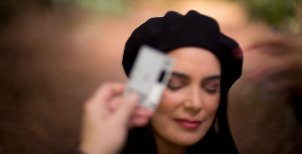
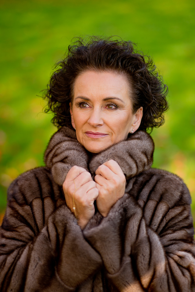
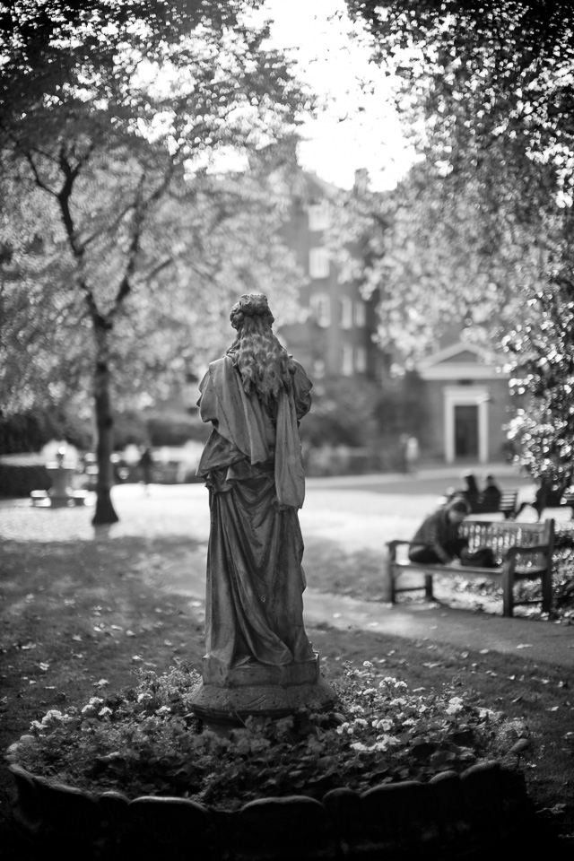


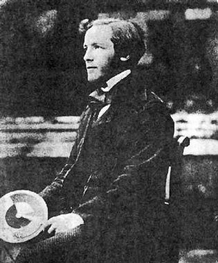
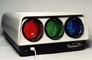
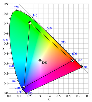


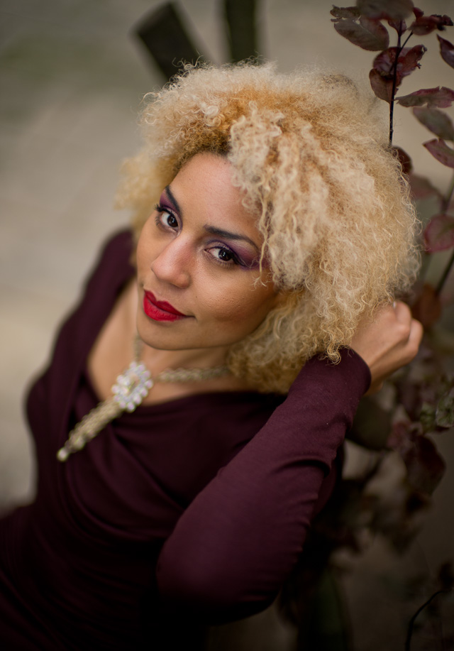
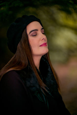
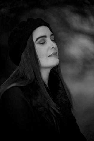
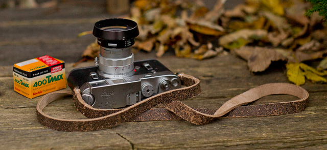
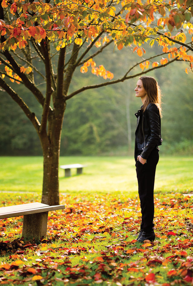

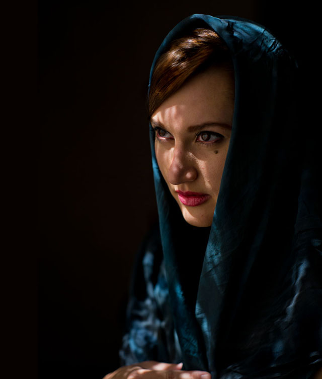
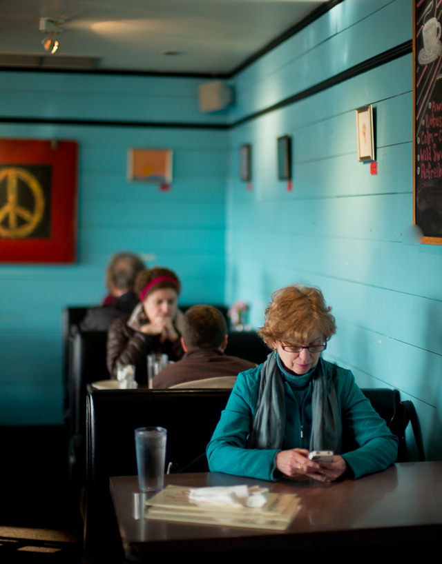


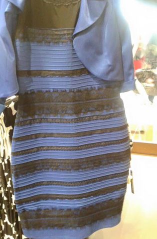
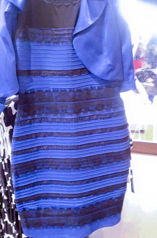
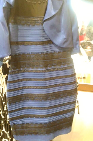
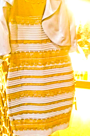


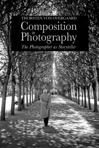
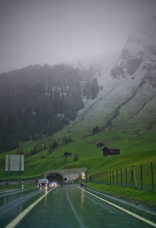
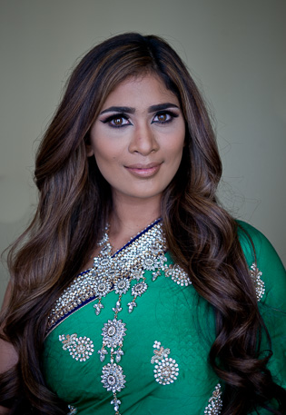

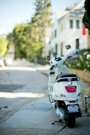
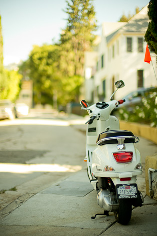
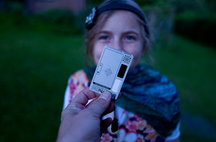
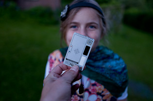
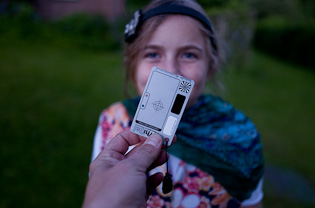
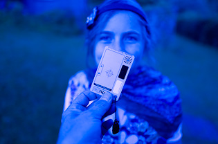
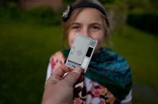

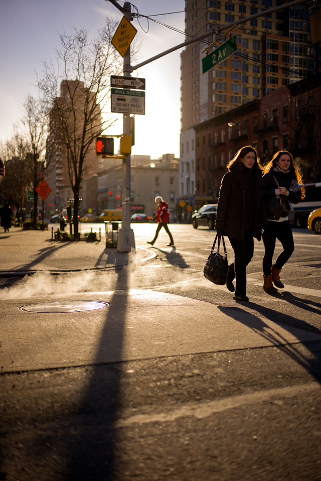
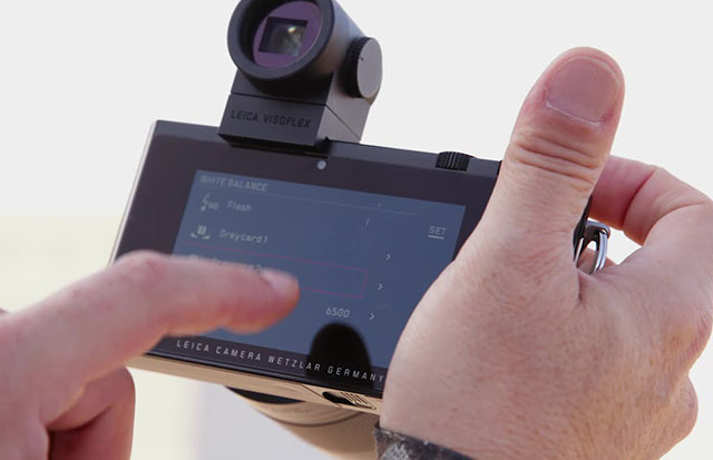
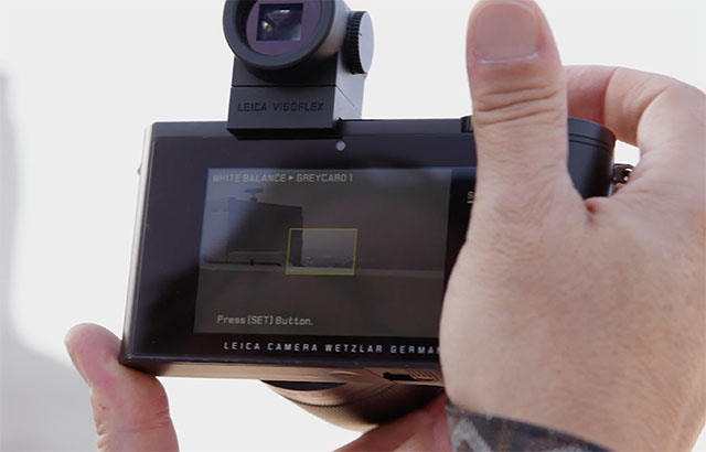
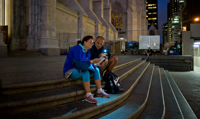
 Here's some of my blue filters I used to use for indoor photography: There is the round glass filter you can screw onto the lens (they exist in different strengths) as well as the blue Kodak color compensating filter in plastic that sets in a filter holder in front of the lens. © 2015 Thorsten Overgaard.
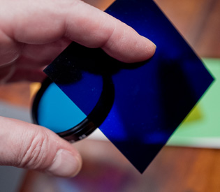
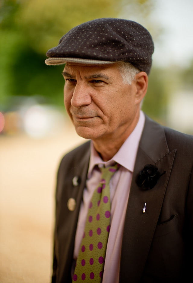
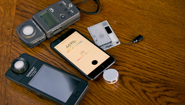
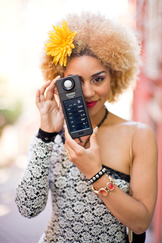

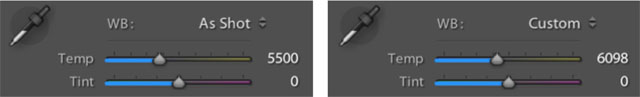
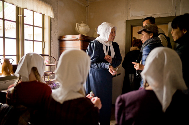
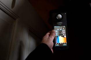
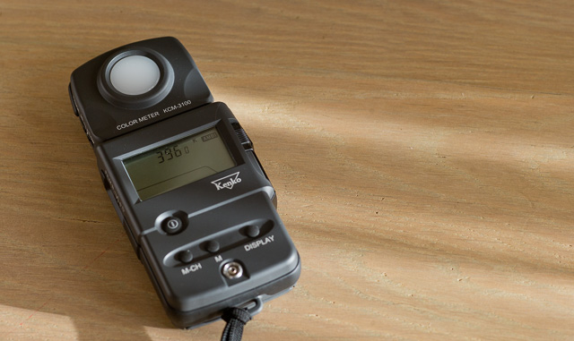
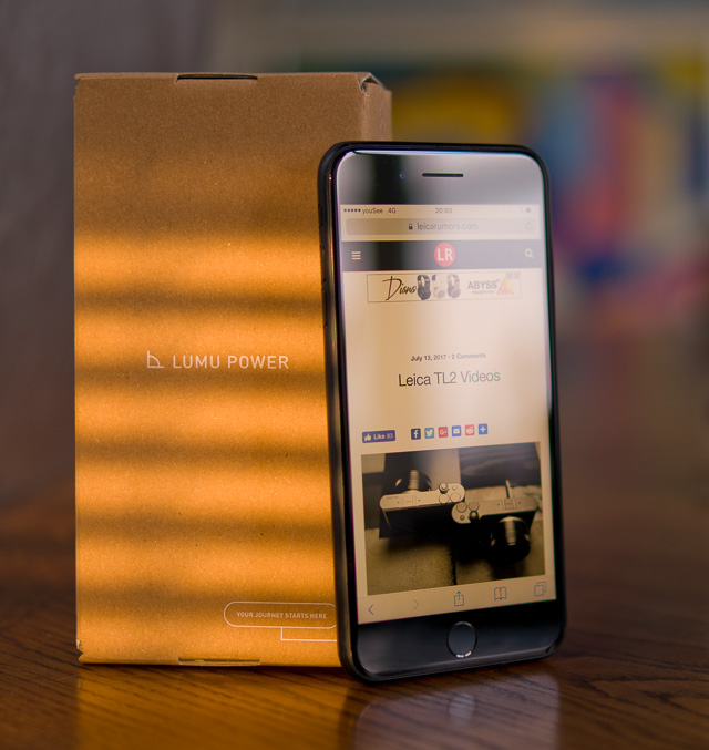
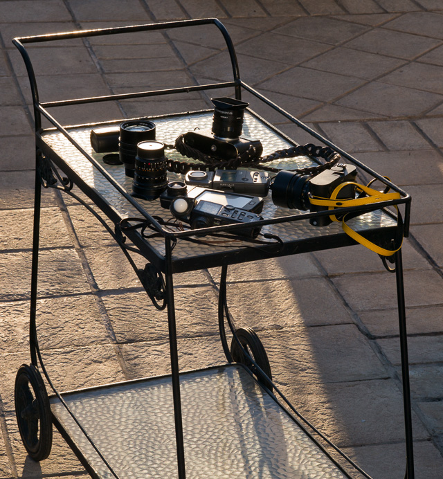
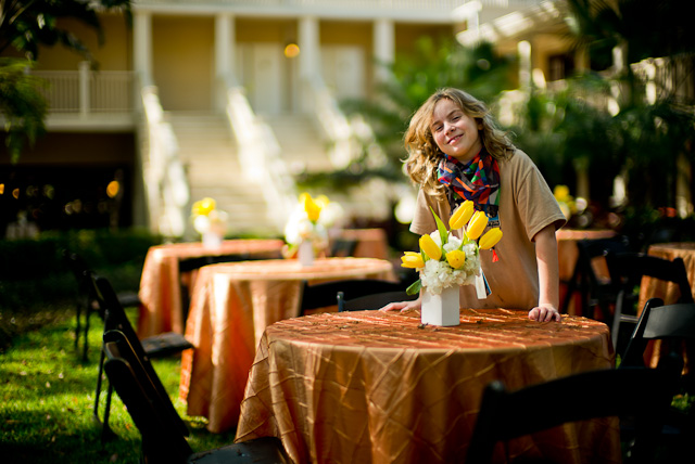

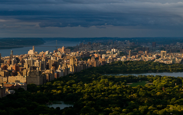
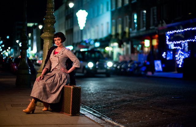
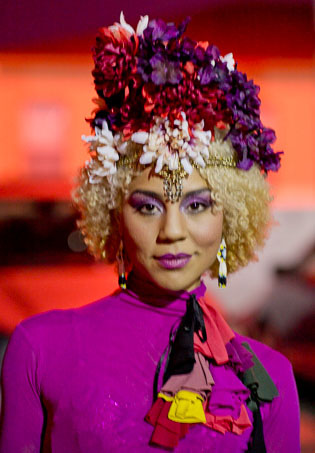


 Shiyo Takahashi, the Lagerfeld of Leica.
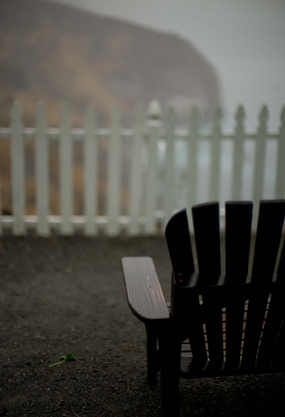
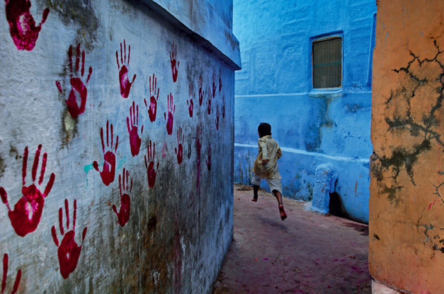
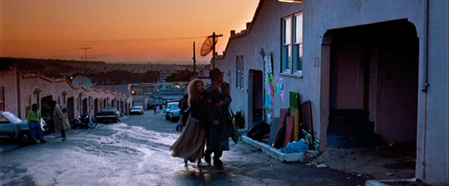
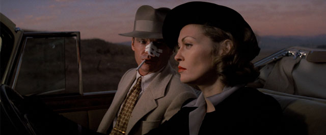
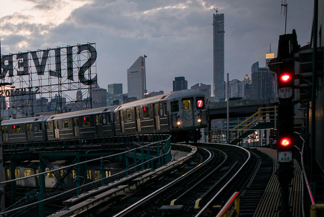
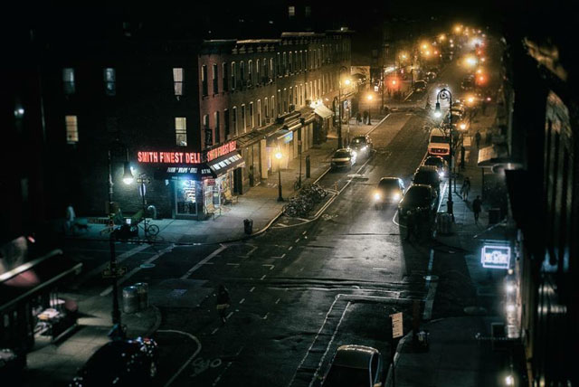
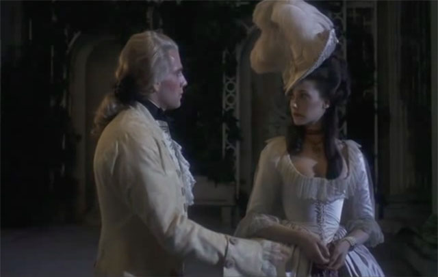

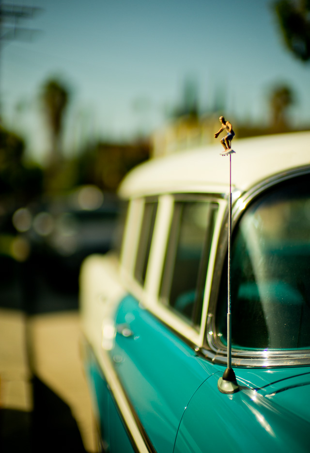


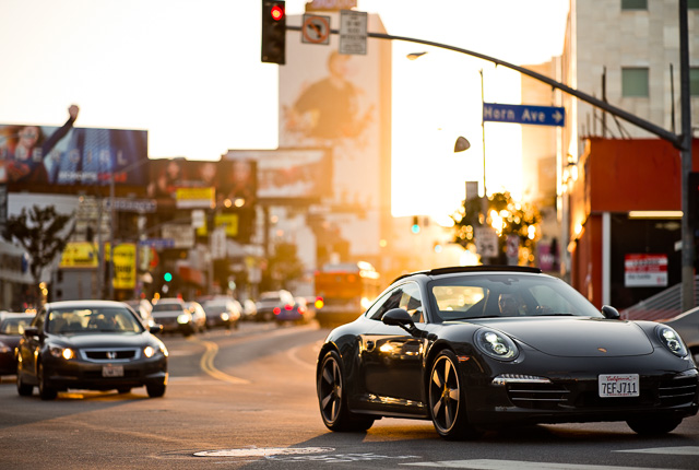


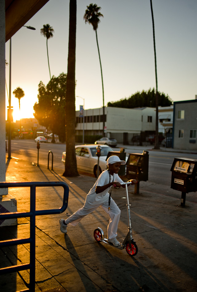
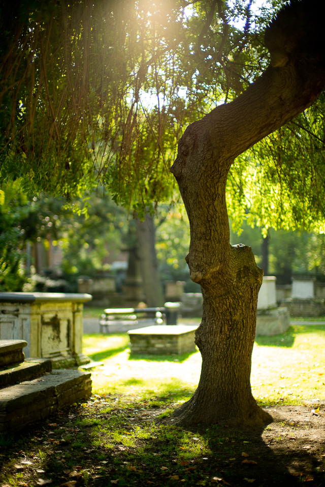
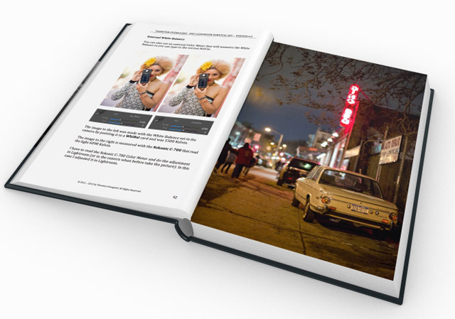


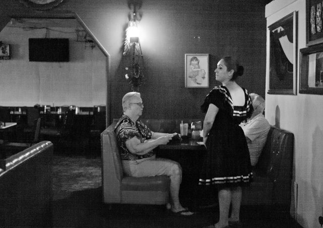

 Bokeh: The visual quality of the out-of-focus areas of a photographic image. Photo at Bar del Fico in Rome.

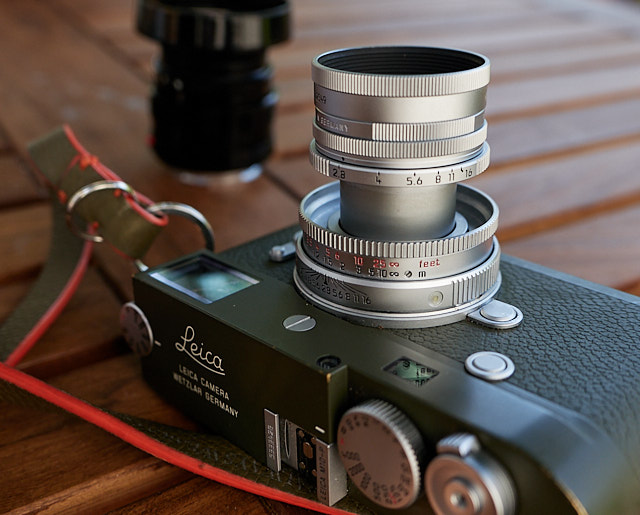
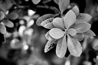
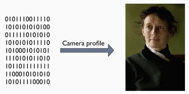
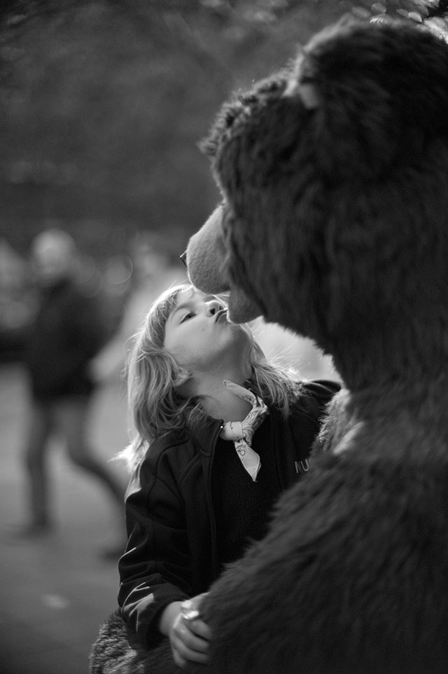
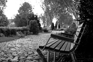
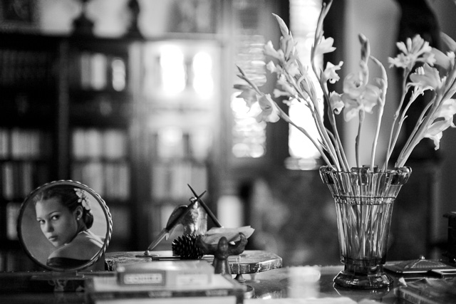
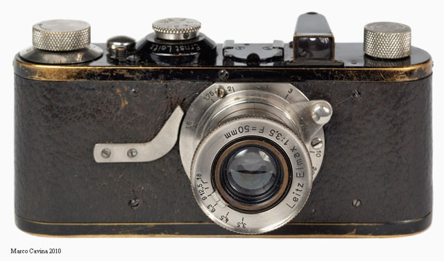


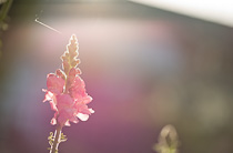
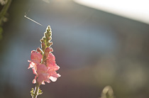
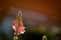

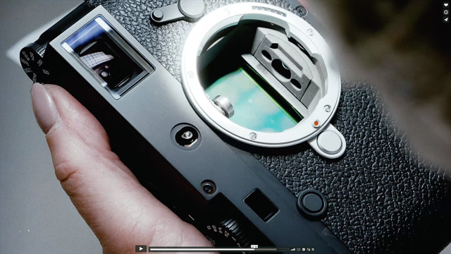
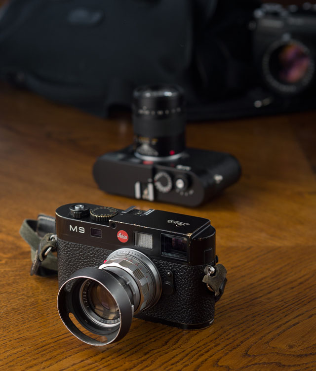
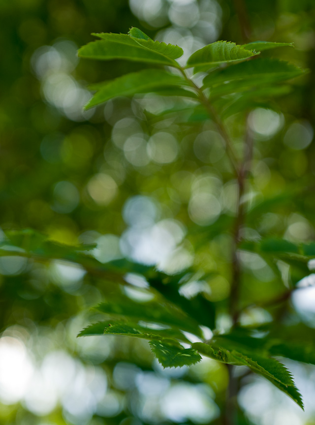
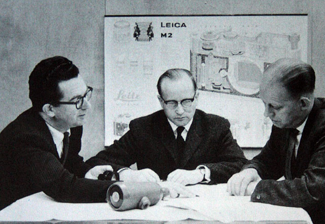
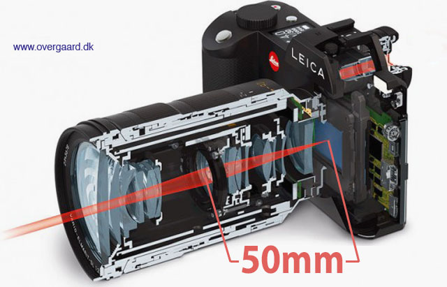
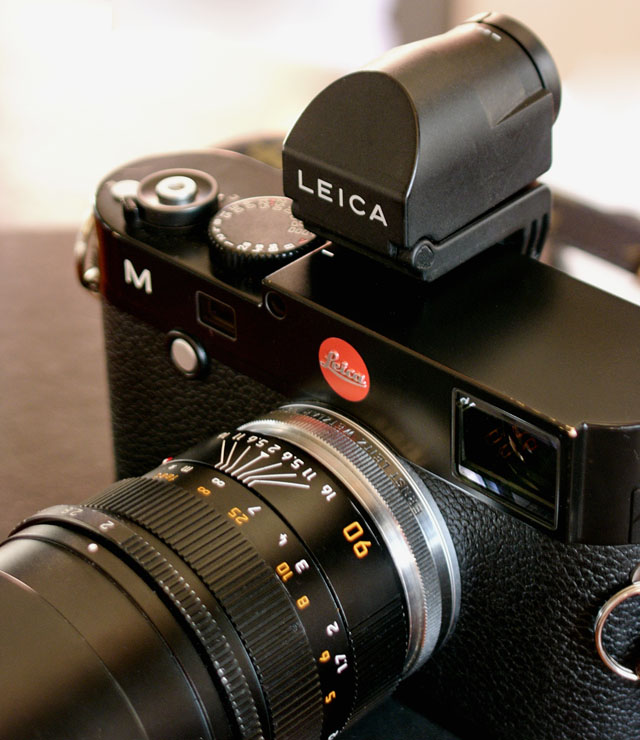 The OUFTO on Leica M Type 240 with Leica 90mm APO-Summicron-M ASPH f/2.0.